ABSee / Guides / Homepage design

Guide

Ecommerce homepage design. What brands test.

This guide covers what ecommerce brands test on their homepage, the page many shoppers open first, apart from the menu and search. ABSee has recorded 100+ brands testing here over May to October 2026.

Updated October 2026 · Source: ABSee record · Methodology →

Galeries LafayetteHomepage
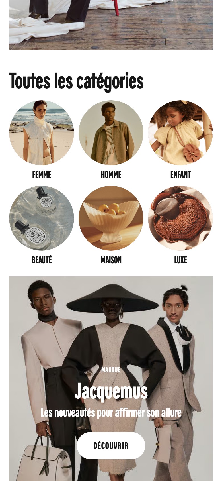
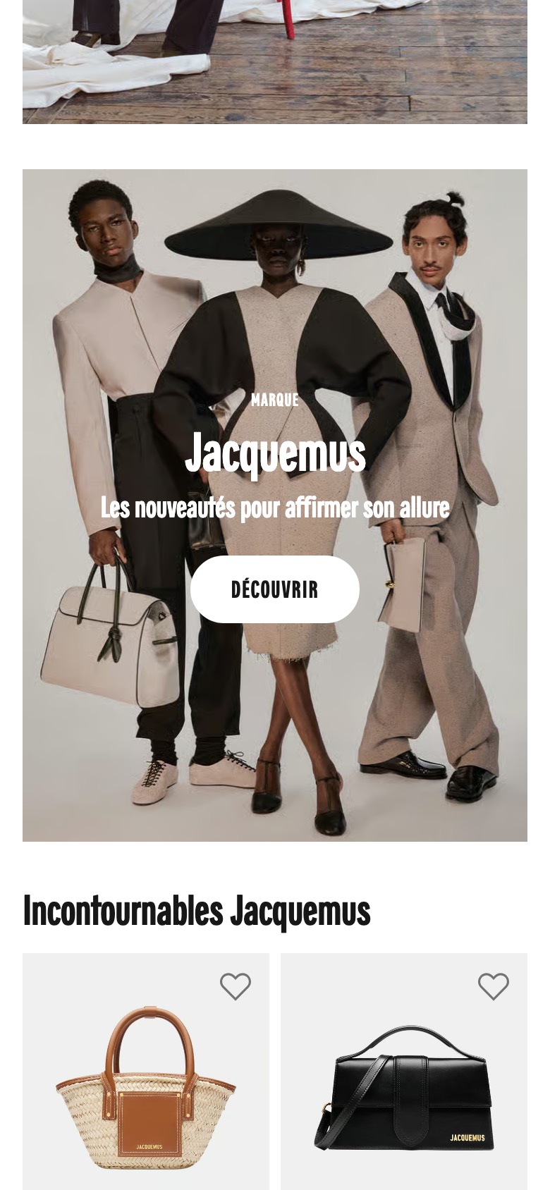
Homepage category shortcut grid removed

What changed The homepage no longer shows the 'All categories' block of round shortcut tiles or its heading, so shoppers scroll straight from the hero into the featured brand campaign.

Seen 22 Aug to 30 Aug 2026

Outcome being confirmed
What brands are testing

Nine themes on the homepage. The changes brands put to a test.

Each tile is one kind of change brands tested on the homepage. The chip is a size word: how many brands in the record tested it.

  • many

    The hero

    Photo swaps, still against moving footage, carousel against a single image, a shorter hero.

  • many

    Category entry points

    Category tiles removed, reordered or replaced by pills, a category row shown by default.

  • many

    Personalised and product rows

    Picked-for-you, most-loved and recently viewed rows, ordered by the shopper's interests.

  • several

    Sign-up and offer pop-ups

    Newsletter pop-ups shown straight away or delayed, offer modals, loyalty and account banners.

  • several

    Announcement and promo bars

    Free-shipping messages removed, rotating against fixed banners, sale wording by country.

  • a couple

    Trust and benefit strips

    A review-score strip, benefits cut to two claims.

  • a couple

    Bringing shoppers back

    A welcome-back recently-viewed pop-up, a cart-reminder pop-up.

  • a couple

    Alternative homepages

    Homepage visitors sent straight to a deals hub or to the all-products grid.

  • a couple

    Quizzes and diagnostics

    A quiz or diagnostic offered from the homepage.

The themes, one by one

The themes, one by one. What brands actually changed.

Four of the themes, with what brands changed. Menu and search changes are covered in the search and navigation guide.

The hero

The first screen is tested in many ways: a new photo, still or moving footage, a carousel or one image, a compact hero with side-by-side buttons, text moved below a shorter image, and a hero chosen by audience.

Category entry points

Brands tested whether shoppers need shortcuts into the range from the homepage: tiles removed, reordered or replaced by pills with products, and swipeable tile rows. Galeries Lafayette tested removing its round category shortcut tiles, shown at the top of this page.

Personalised and product rows

Rows below the hero picked for the shopper, most-loved and recently viewed products, rows ordered by the shopper's interests, and recommendations switched to discounted products.

Sign-up and offer pop-ups

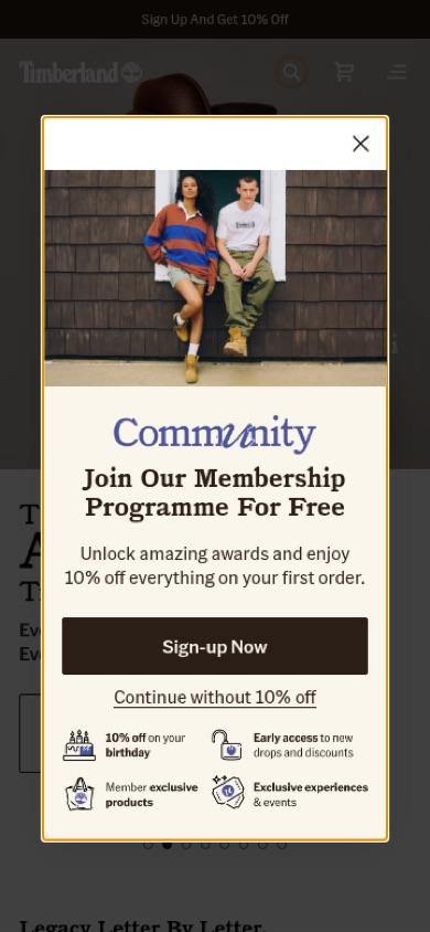
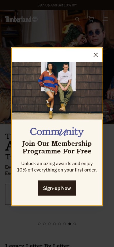
When a sign-up pop-up appears, what it offers and how a visitor declines. Timberland tested adding a member-benefits list and a clearly named opt-out to its pop-up; the record is shown in full below.

What a record looks like

One experiment, in full. The record behind every theme.

Every theme above is made of records like this one, with every field shown: before and tested, what changed, the likely hypothesis, the takeaway, the dates and what the brand did next.

TimberlandHomepage
ShippedIntelligence plan
Membership pop-up adds a benefits list and opt-out link

Seen 6 Aug to 4 Oct 2026

Problem being solved and strategic takeaway
Problem being solved
A pop-up that only offers a one-off discount gives visitors little reason to join the programme
Strategic takeaway Intelligence plan
Backing a sign-up discount with a short list of ongoing member benefits can make joining feel worth more than the one-off offer, and naming what the visitor gives up by declining makes the choice explicit.
Principle Intelligence plan
Value Stacking
Bring a hypothesis

Bring a hypothesis. See who tested something like it.

Three hypotheses to bring to your assistant about the homepage, each written as if, then, because:

  • Category tilesIntelligence plan
    Our hypothesis: if we remove the category tiles under the hero, then more shoppers will reach the featured products, because nothing sends them into the menu first.

    Comes back with comparable experiments, for and against.

  • Sign-up pop-upIntelligence plan
    Our hypothesis: if we delay the sign-up pop-up, then more shoppers will browse past the homepage, because nothing blocks the first screen.

    Comes back with comparable experiments, for and against.

  • HeroIntelligence plan
    Our hypothesis: if we replace the hero carousel with one image, then more shoppers will click through, because there is one clear message.

    Comes back with comparable experiments, for and against.

How to use this

How to use this. Evidence for a hypothesis, not an answer.

  1. Find the problem in your own data

    Start from where your own shoppers leave or hesitate.

  2. Check what the market tried

    Find brands like yours, what they tested and what they did next.

  3. Test it yourself

    Only your own experiment tells you what works on your site.

What this page does not tell you

What this page does not tell you. And why.

  • Whether it works

    No outcome rates. Whether each brand kept a change is part of the Intelligence plan.

  • When a brand started

    First seen is when ABSee first recorded a test, not when the brand began it.

  • What will work for you

    One experiment is one brand's decision, with its own shoppers.

Questions

Questions

Which homepage designs increase conversion?

ABSee publishes no rate for any theme here. The record shows, per experiment, whether the brand kept the change; that is part of the Intelligence plan.

What do brands test most on the homepage?

In the ABSee record, many brands tested the hero, category entry points and personalised product rows. Several tested sign-up pop-ups and announcement bars.

Is this a gallery of homepage designs?

No. It describes what brands put to a test on the homepage, with two real records. The before and after for every experiment is in the record.

Which brands are named on this page?

Galeries Lafayette and Timberland, as public examples. The other brands are named in the record.

Ask your assistantWhat do brands test on their homepage?

Works in Claude, ChatGPT or Gemini once ABSee is connected.

Connect your AI →

Bring your homepage problem. See what other brands tested first.

Get a demo