Why real examples
Most A/B test examples online are hypothetical — "try a red button" — or the same handful of case studies, years old, retold from list to list. They tell you what someone thought might work, not what a brand actually put in front of shoppers and then decided.
A real example is evidence you can weigh. ABSee is experimentation intelligence for ecommerce: a record of real experiments run by 1,150+ brands, with the page before, the version tested, and whether it was kept. The examples below come from that record, each shown as the full record: what changed, the likely hypothesis, the strategic takeaway and principle, the dates and what the brand did next. The orange corners mark the change.
For what brands are testing right now, see the holiday checkout report and the monthly fashion and beauty pulses.
What makes a good example
- A real split. Two versions of the same page served to ordinary visitors at the same time, not a redesign that replaced the old page for everyone.
- A public page. Something any shopper could see.
- Dated. When it was first and last seen, so you know how current it is.
- An outcome in plain words. Shipped means the tested version became the page; rolled back means the original stayed. It is the brand's decision, not a measured lift.
Product page
Pattern pages: size and fit, sticky add-to-cart, social proof, low-stock and urgency messages and reviews on the product page. All of them are on the product page hub.
 Before
 Tested
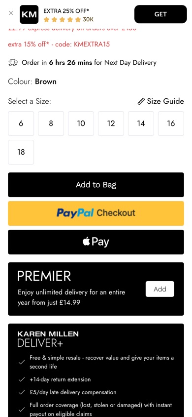
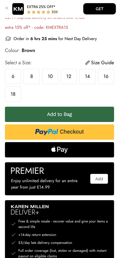
Karen MillenProduct page
Green Add to Bag button- What changed
- A shopper on a product page sees the Add to Bag button in deep green instead of black. The wording, size and position of the button are unchanged, as are the PayPal and Apple Pay buttons below it.
- Likely hypothesis
- If Karen Millen turns the Add to Bag button green, then more shoppers will add to bag, because a distinct action colour draws the eye to the main next step.
- Strategic takeaway
- Giving the primary action a colour that contrasts with its surroundings can shorten the search for the next step.
- Principle
- Visual Salience
Seen 27 Aug to 27 Aug 2026
 Before
 Tested
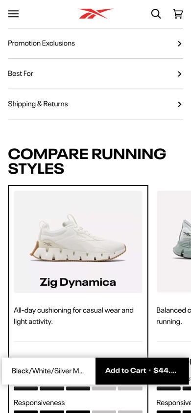
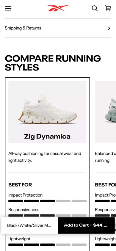
ReebokProduct page
'Best For' section removed- What changed
- A shopper scrolling the product page details sees Specifications, Promotion Exclusions and Shipping & Returns, but no longer a 'Best For' section between them.
- Likely hypothesis
- If Reebok removes the 'Best For' section from the product details, then more shoppers will add to cart, because a shorter details list gets them to the buying decision with fewer low-value sections to scan.
- Strategic takeaway
- Removing a low-engagement content section and measuring the result is a cheap way to find which product-page elements actually earn their place. The brand kept this after testing.
- Principle
- Subtractive Testing
Seen 7 Aug to 4 Oct 2026
 Before
 Tested
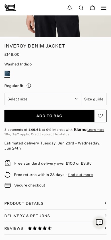
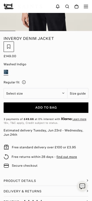
AllSaintsProduct page
Wishlist button moved to the product name- What changed
- A shopper viewing a product page sees the wishlist button relocated next to the product name. This is one of two variations being compared; while both test arms relocate the button to this high-visibility area, this specific version also changes the default wishlist icon to a bookmark symbol.
- Likely hypothesis
- If AllSaints moves the wishlist button under the product name as a bookmark, then more shoppers will save items to their wishlist, because the action sits in their main reading path, where it is easier to find.
- Strategic takeaway
- Positioning secondary actions like save options directly alongside primary focal points like product titles improves interaction consistency.
- Principle
- Action Proximity
Seen 19 Jun to 17 Jul 2026
 Before
 Tested
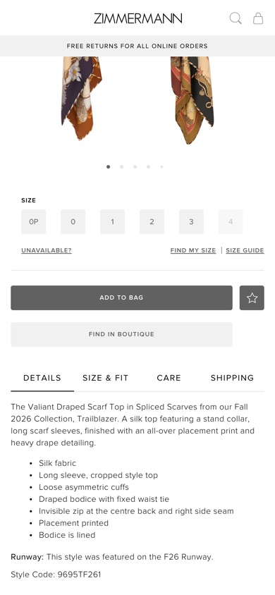
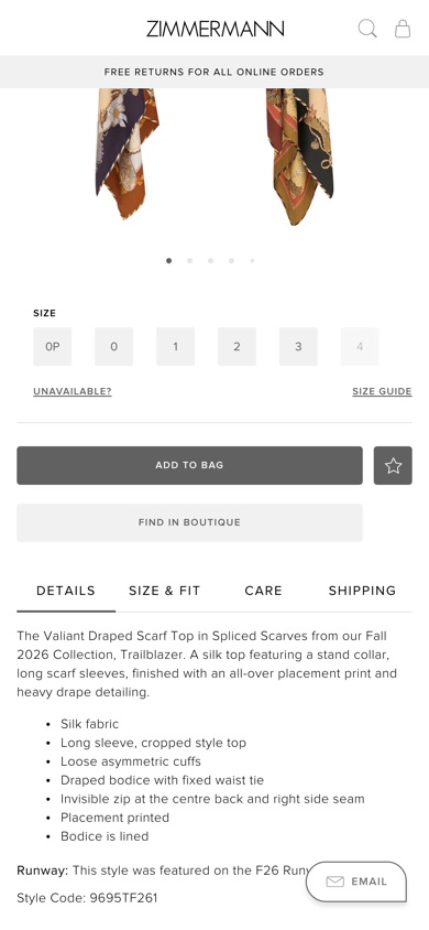
Zimmermann
Product page- What changed
- A shopper evaluating an item on the product page no longer sees the automated sizing and measurement tool, relying instead on standard manual size selection.
- Likely hypothesis
- If Zimmermann removes the automated sizing tool, then more shoppers will add to cart, because they skip a secondary decision widget and go straight to buying.
- Strategic takeaway
- Removing secondary decision-making widgets can decrease cognitive load and streamline the main conversion funnel.
- Principle
- Feature Simplification
Seen 21 Jul to 5 Aug 2026
Category page
What shoppers see first when they browse a range: the header above the grid and the photo on each listing tile.
 Before
 Tested
LancômeCategory page
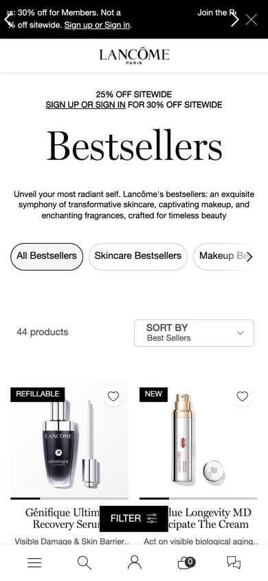
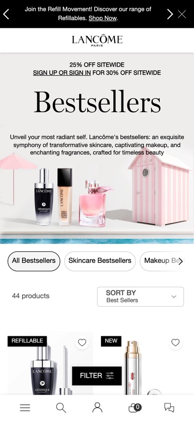
Campaign image in the category header- What changed
- A shopper browsing a category page sees a structural change to the top of the page. This is one of several header layouts being compared. In this specific layout, the topmost promotional slot is hidden, and a new responsive hero banner is introduced with the headline text centered over the image on desktop screens and stacked below it on mobile.
- Likely hypothesis
- If Lancôme drops the top promotional slot and sets a campaign image behind the Bestsellers header, then more shoppers will click through to products, because there is less to distract them above the fold and they can start browsing sooner.
- Strategic takeaway
- Simplifying top-of-page layouts by removing secondary promotional slots can help visitors focus immediately on the main content.
- Principle
- Cognitive Load
Seen 8 Jun to 21 Jun 2026
 Before
 Tested
BirkenstockCategory page
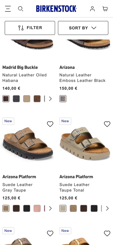
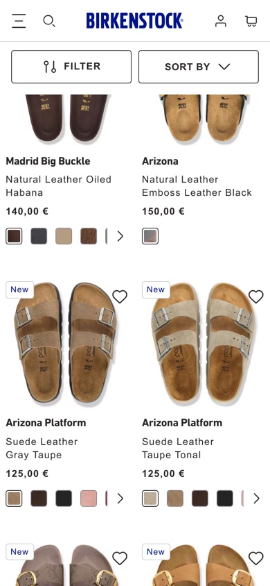
Top-down photos on listing tiles- What changed
- A shopper browsing the sandals category sees each product shown from a top-down view as the primary tile image instead of the default studio shot, while the secondary hover image stays the same.
- Likely hypothesis
- If Birkenstock leads each listing tile with a top-down photo of the sandal, then more shoppers will click through to the product page, because an overhead view shows the footbed shape and strap layout they use to judge fit at a glance.
- Strategic takeaway
- Leading a product grid with the angle that answers the shopper's main question can reduce evaluation effort and speed browsing decisions.
- Principle
- Angle Selection
Seen 15 Sep to 21 Sep 2026
Homepage
The first page many shoppers open: navigation shortcuts and the sign-up pop-up.
 Before
 Tested
Galeries LafayetteHomepage
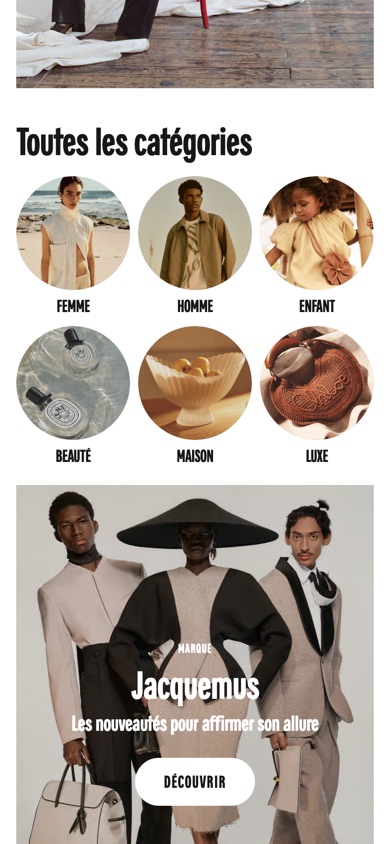
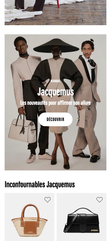
Homepage category shortcuts removed- What changed
- A shopper landing on the homepage no longer sees the 'All categories' block of round shortcuts — womenswear, menswear, kids, beauty, home and luxury — or its heading, so they scroll straight from the hero into the featured brand campaign and its products.
- Likely hypothesis
- If Galeries Lafayette removes the category shortcut tiles from its homepage, then more shoppers will click through to the featured campaign, because they reach it sooner instead of being sent off into a generic category menu.
- Strategic takeaway
- Removing a generic navigation block from a landing page can push more attention into the featured campaign below it, though it may cost shoppers who prefer to browse by category.
- Principle
- Path Consolidation
Seen 22 Aug to 30 Aug 2026
 Before
 Tested
Timberland
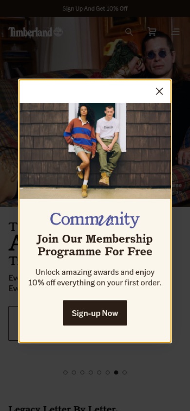
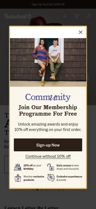
Homepage- What changed
- A logged-out visitor on the homepage gets the Community membership sign-up pop-up. In the new version it lists four member benefits (birthday discount, early access to drops, member-exclusive products, exclusive events) under the offer, shows a full-width 'Sign-up Now' button, and adds a link to continue without the discount, so the visitor can decline clearly.
- Likely hypothesis
- If Timberland lists concrete member benefits under its first-order discount and gives the sign-up pop-up a clearly named opt-out, then more visitors will sign up, because ongoing value gives them more reason to join than a one-off discount, and a named opt-out makes the cost of leaving visible.
- Strategic takeaway
- Backing a sign-up discount with a short list of ongoing member benefits can make joining feel worth more than the one-off offer, and naming what the visitor gives up by declining makes the choice explicit.
- Principle
- Value Stacking
Seen 6 Aug to 4 Oct 2026
Cart and checkout
From the mini-cart to the first step of checkout. Pattern pages: free-shipping progress bar, express checkout buttons and coupon code field. All of them are on the cart and checkout hub.
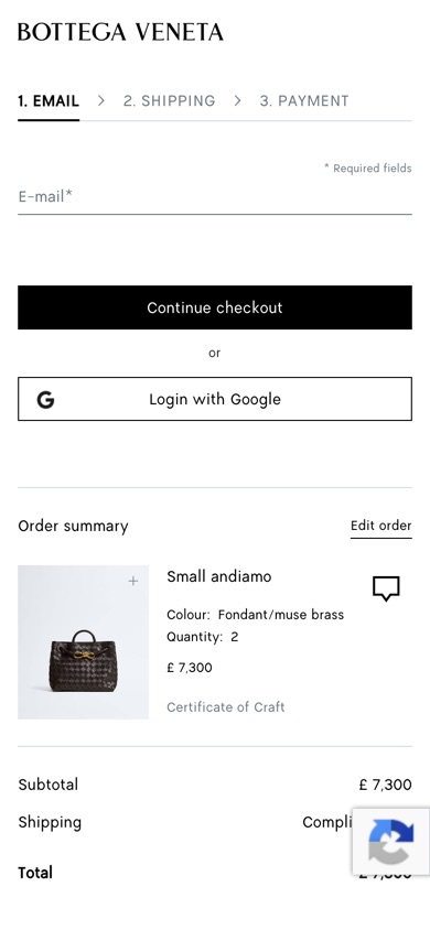 Before
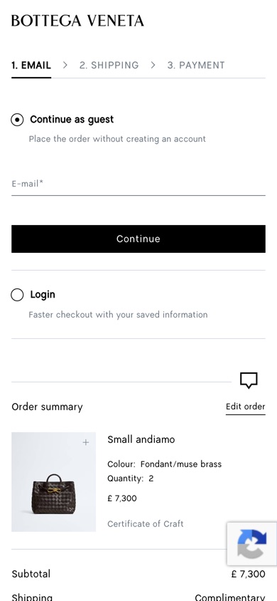 Tested
Bottega VenetaCheckout
Guest checkout as an explicit choice- What changed
- A shopper on step 1 (E-mail) of checkout sees a selected 'Continue as guest' option ('Place the order without creating an account') with the e-mail field and a Continue button, and below it a 'Login' option ('Faster checkout with your saved information'). The control shows an e-mail field, a 'Continue checkout' button and a 'Login with Google' button.
- Likely hypothesis
- If Bottega Veneta makes guest checkout an explicit, pre-selected choice next to login, then more shoppers will get past the e-mail step, because shoppers without an account see a clear path that does not ask them to register.
- Strategic takeaway
- Presenting an explicit low-commitment path beside account login can reduce abandonment by removing the perceived need to register.
- Principle
- Choice Architecture
Seen 3 Aug to 7 Sep 2026
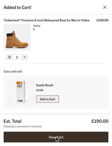 Before
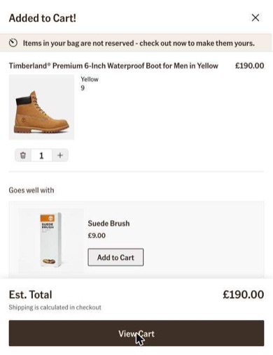 Tested
Timberland
Mini-cart- What changed
- A shopper expanding the mini-cart sees a newly added warning message stating that items in their bag are not reserved. This explicit nudge encourages them to check out immediately to ensure they do not miss out on the items.
- Likely hypothesis
- If Timberland warns in the mini-cart that items in the bag are not reserved, then more shoppers will go on to checkout, because the fear of losing what they picked makes securing it feel urgent.
- Strategic takeaway
- Explicitly stating that carted items are not reserved leverages the fear of missing out, prompting faster checkout decisions.
- Principle
- Loss Aversion
Seen 19 May to 4 Oct 2026
More from well-known brands
More experiments from the record, shown as compact cards: the page before, the version tested, what changed and the dates. The chip shows what the brand did next; a card without a chip shows what the test looked like, and its outcome is being rechecked.
 Before
 Tested
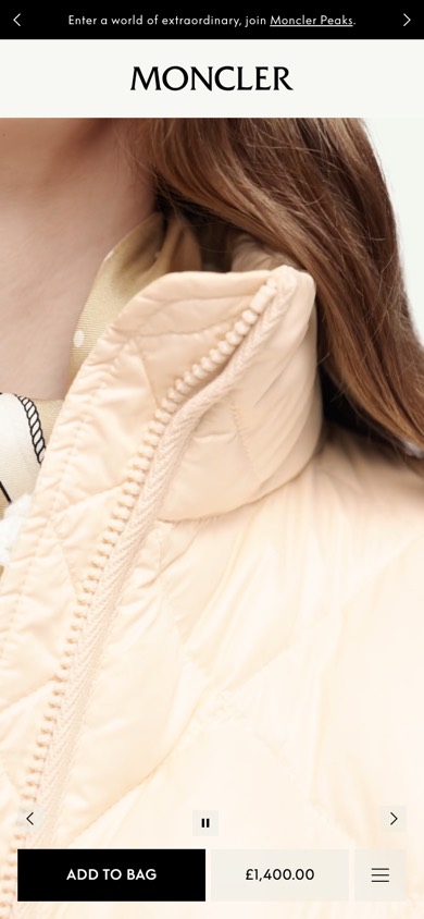
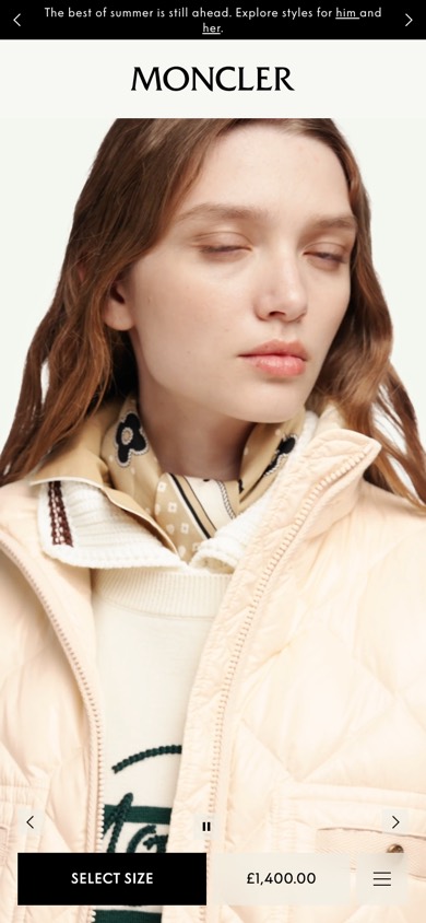
Moncler
Product pageProduct page size-prompt buttonWhat changed Relabels the purchase button to prompt size selection first.
Seen 3 Aug to 18 Sep 2026
 Before
 Tested
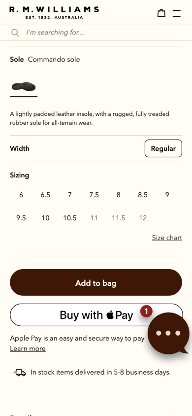
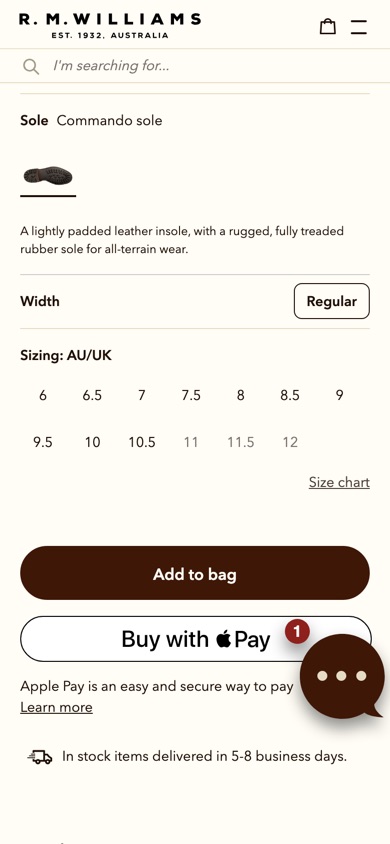
R.M.Williams
Product pageProduct page size-label wordingWhat changed Renames the "Sizing" label above the size options.
Seen 14 Aug to 1 Sep 2026
 Before
 Tested
Zimmermann
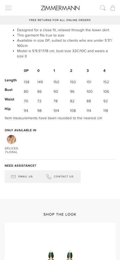
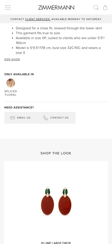
Product pageProduct page size guide additionWhat changed Adds a size guide link inside the product details.
Seen 14 Jul to 1 Sep 2026
 Before
 Tested
Kiehl's
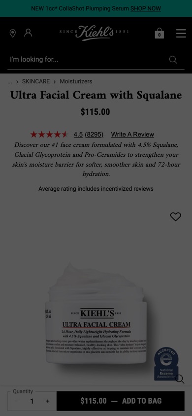
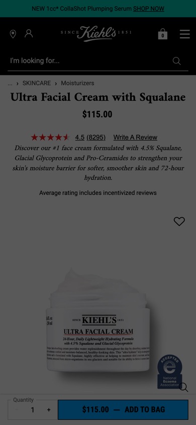
Product pageProduct page sticky buy barWhat changed Pins the add-to-cart area to the bottom of the screen while scrolling.
Seen 31 Jul to 7 Aug 2026
 Before
 Tested
Cotopaxi
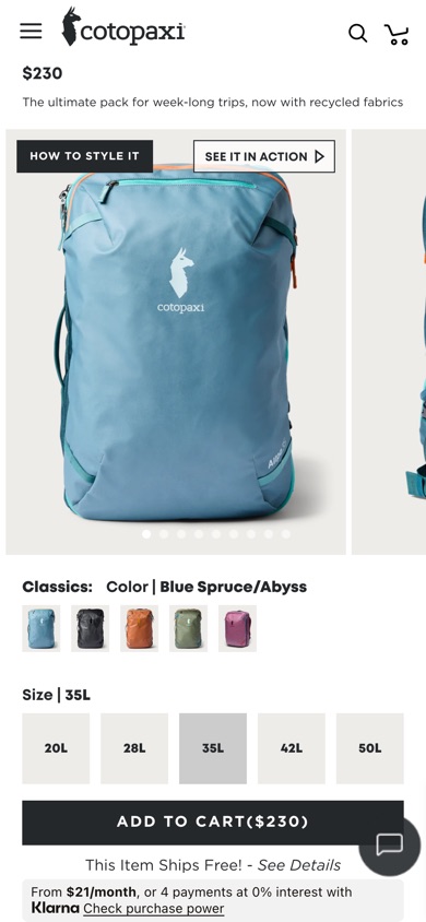
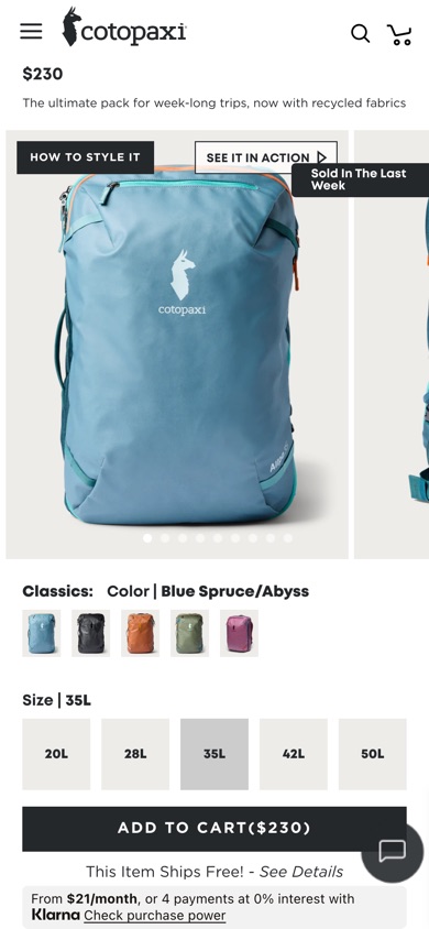
Product pageProduct page purchase-count popupWhat changed Shows how many people bought the item in the last week.
Seen 4 Jul to 24 Jul 2026
 Before
 Tested
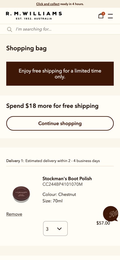
R.M.Williams
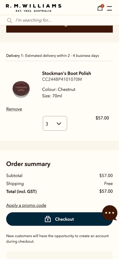
CartCart page free-shipping tracker additionWhat changed Adds a free-shipping progress tracker and next-step buttons to the cart.
Seen 16 May to 10 Aug 2026
 Before
 Tested
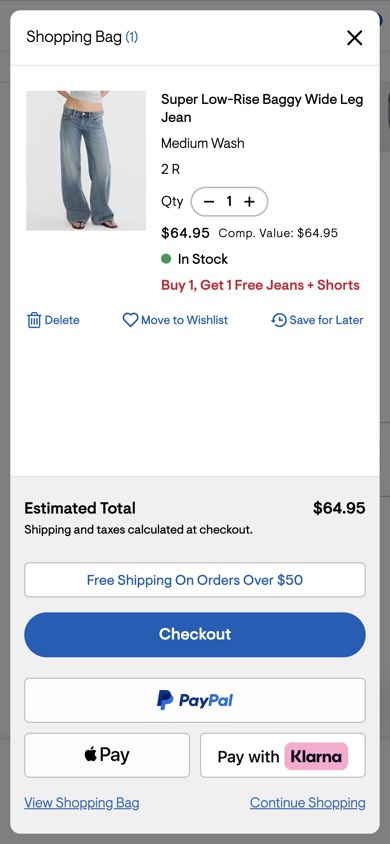
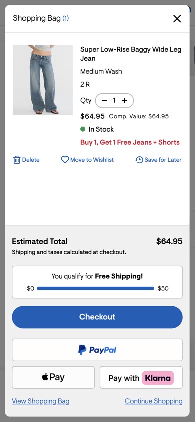
Aéropostale
Mini-cartMini-cart free shipping meter additionWhat changed Adds a progress bar showing how much more to spend for free shipping.
Seen 16 May to 13 Jul 2026
 Before
 Tested
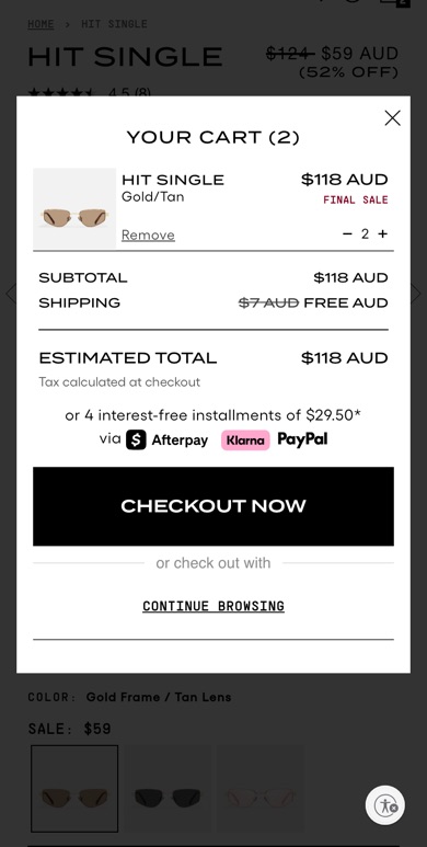
Quay
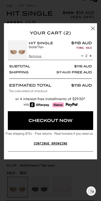
CartCheckout button reassurance messagingWhat changed Adds shipping, returns and support reassurance by the checkout button.
Seen 24 Jul to 11 Sep 2026
 Before
 Tested
New Balance
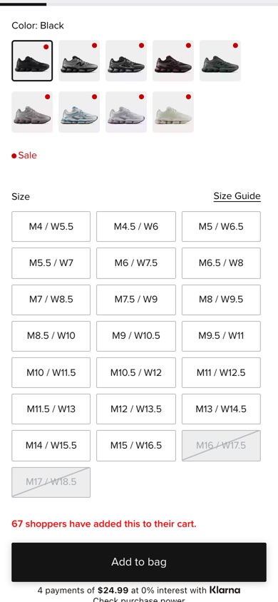
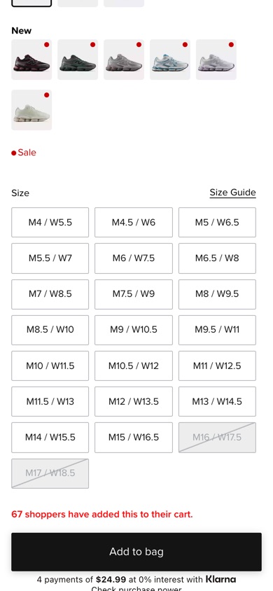
Product pageProduct page separate new colors rowWhat changed Groups newly added colours into their own row.
Seen 2 Jun to 16 Jul 2026
 Before
 Tested
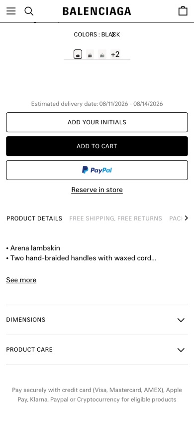
Balenciaga
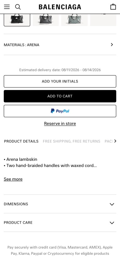
Product pageProduct page colour-swatch consolidationWhat changed Gathers every colour and material into one row under the product.
Seen 3 Aug to 17 Sep 2026
 Before
 Tested
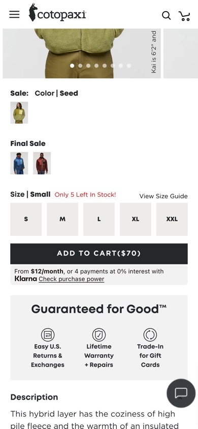
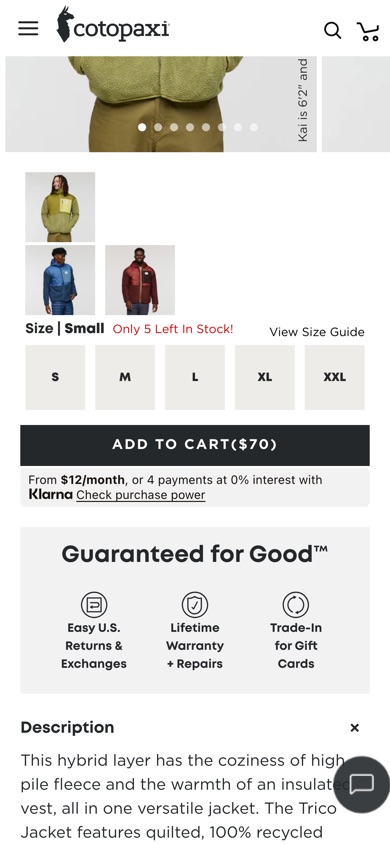
Cotopaxi
Product pagePhoto colour swatchesWhat changed Replaces plain colour swatches with product-photo swatches.
Seen 4 Jul to 31 Jul 2026
 Before
 Tested
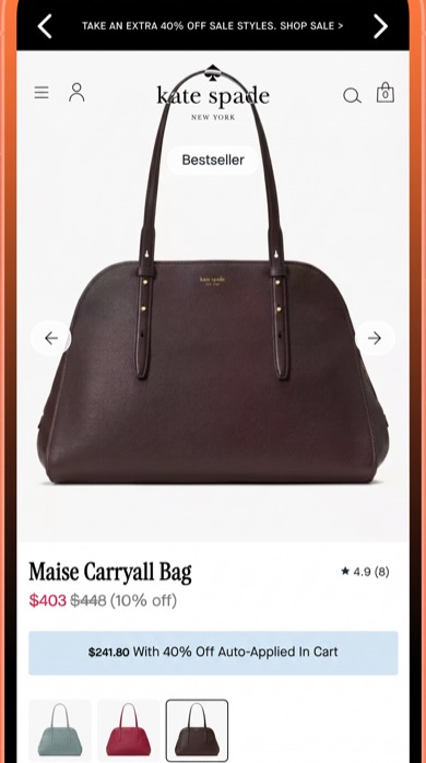
Kate Spade
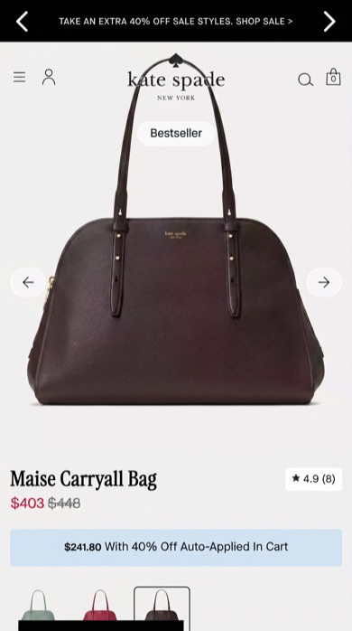
Product pageProduct discount percentage removalWhat changed Hides the percentage-off label, showing only the sale price.
Seen 19 May to 17 Jul 2026
How to use these
- Start from your own problem. A drop-off at size selection points to the size examples, not the swatch ones.
- Read both outcomes. A change one brand rolled back is as useful as one it kept.
- Test it yourself. Another brand's decision is evidence for your hypothesis, not a result for your site.
The record holds 10,000+ experiments; ask it inside Claude, ChatGPT or Gemini.
Questions
What is an example of an A/B test?
Reebok tested its product page without the 'Best For' section in the product details, against its original page. Both versions were served to ordinary visitors at the same time, seen from 7 August to 4 October 2026. Reebok kept the shorter page.
Where can I find real A/B test examples?
Most lists online reuse the same old case studies. ABSee keeps a record of 10,000+ real experiments run by 1,150+ ecommerce brands, with the page before, the version tested and whether it was kept.
Do these examples show which version won?
They show what the brand did next: whether the tested version became the page (shipped) or the original stayed (rolled back). That is the brand's decision, not a measured lift. No outside tool sees a brand's own numbers.
Should I copy a test another brand kept?
Treat it as evidence for a hypothesis, not a result to copy. Your shoppers, traffic and prices differ.