Holiday checkout 2026. What retailers are testing in cart and checkout.
Real cart and checkout experiments from well-known retailers, in test going into the holiday peak, each shown in full and grouped by what is being tested. ABSee has recorded 50+ brands testing here over September to October 2026.16 experiments · 15 brands · as of 4 October 2026absee.it/reports/holiday-checkout-2026 · as of 4 October 2026
Updated October 2026 · Source: ABSee record · Methodology →
What stands out
The promo code box is pulling in two directions. Champion drops it from the cart drawer and Puma takes it out of checkout, while Claudie Pierlot shows it open and labelled. See the experiments
Reassurance shows up in the cart and at checkout. Patagonia puts its full guarantee under the cart total, Vans adds service badges under the checkout header, and Comptoir des Cotonniers swaps its secure-payment line for a pay-in-four line. See the experiments
Three brands are simplifying the cart. Clarins removes the subscribe option, Calvin Klein shrinks basket images, and Benetton makes Checkout the one full-width button. See the experiments
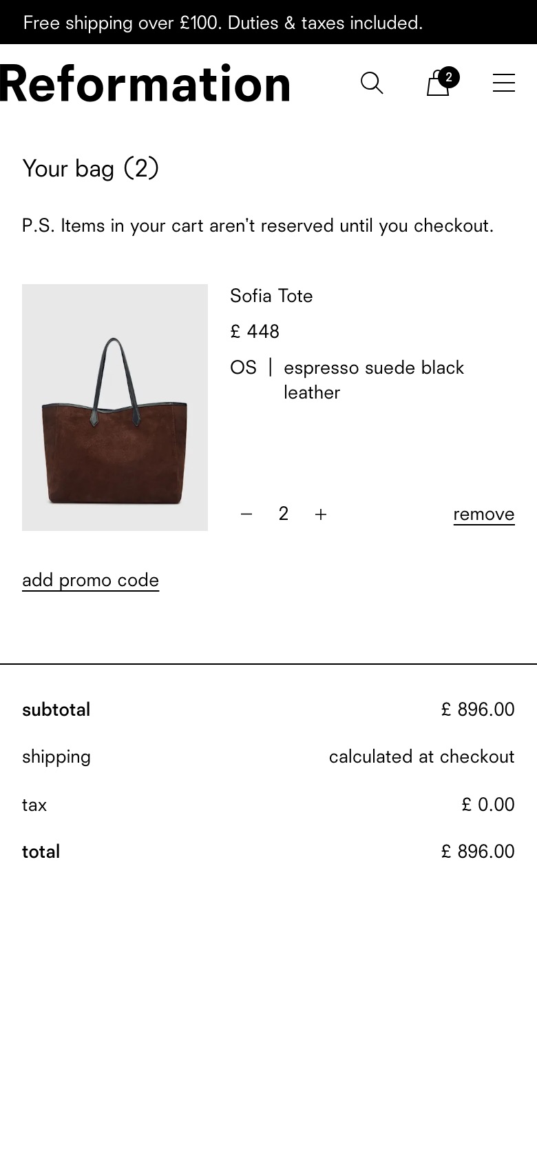
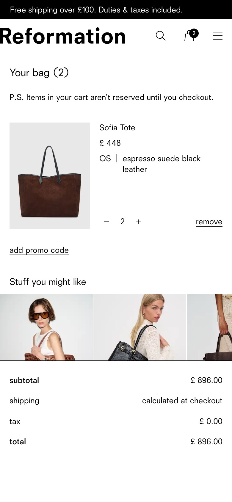
Cross-sell in the cart goes both ways. Reformation removed cart recommendations and kept it that way. Comptoir des Cotonniers adds a “you may also like” bar under the basket item. See the experiments
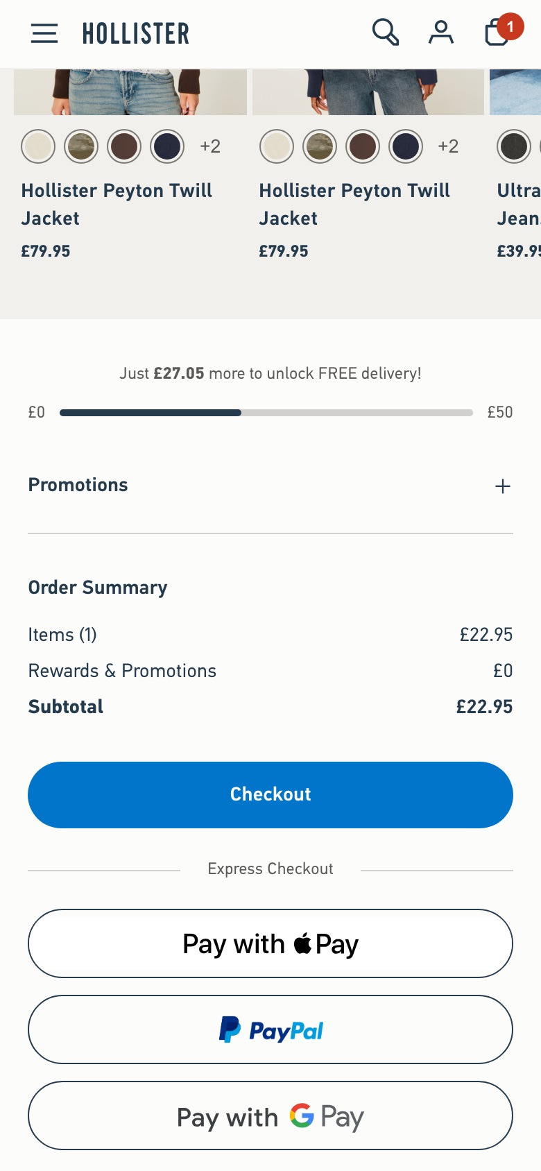
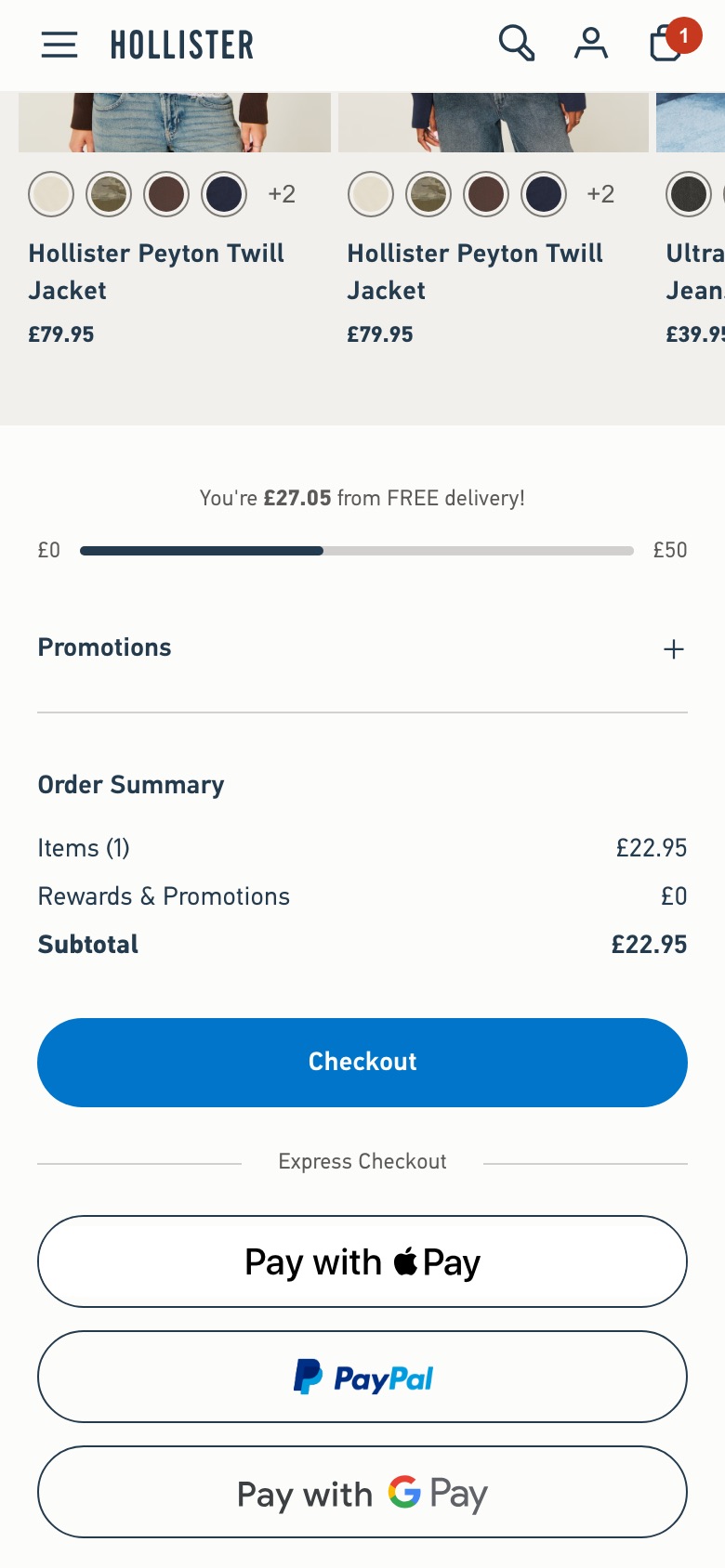
Small words and positions around delivery. Hollister rewords its free-delivery message as something to unlock; Intimissimi moves the delivery estimate below the stock availability notice. See the experiments
Promo code box
Whether the box for a discount code shows in the cart and checkout, and how.
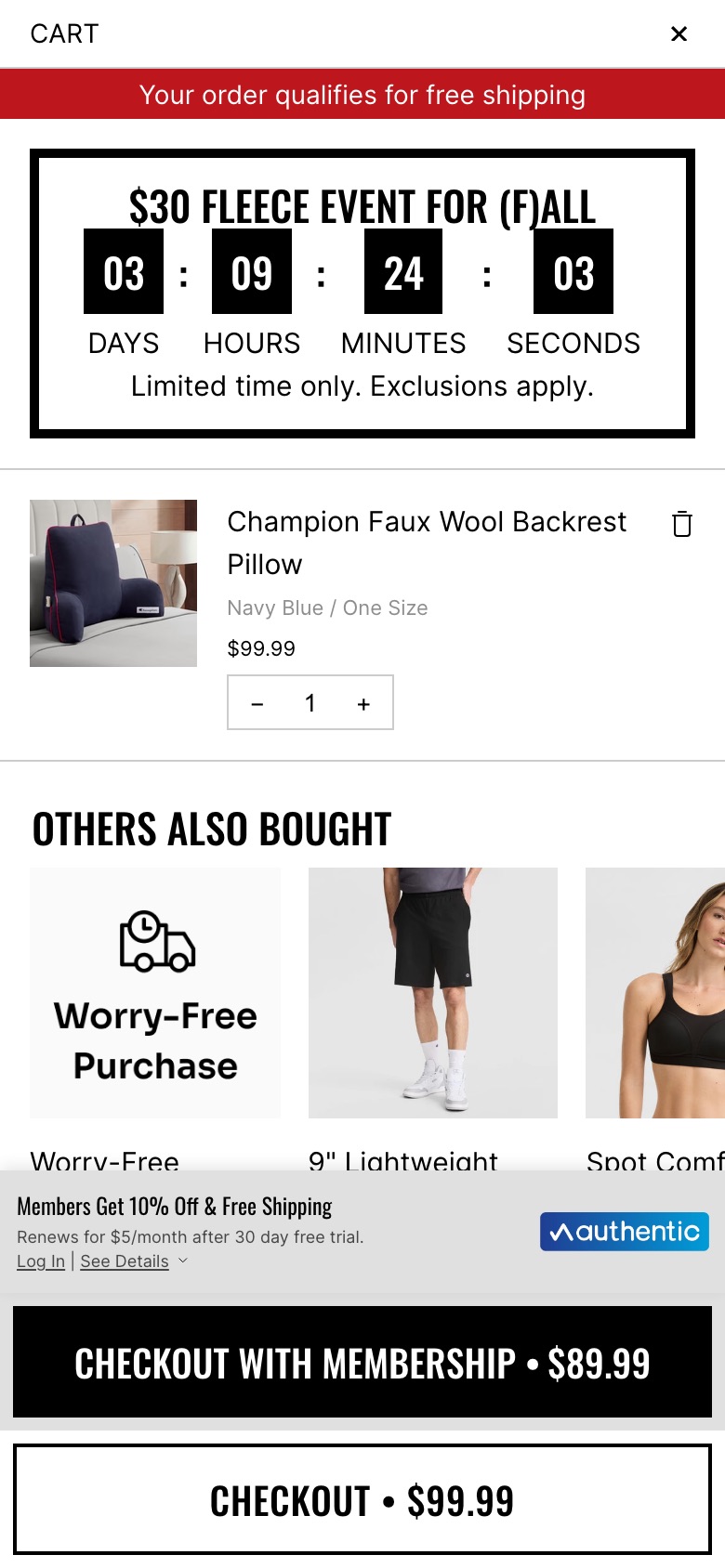
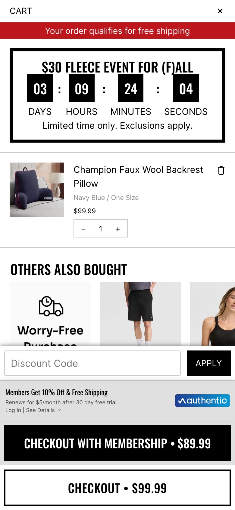
The 'Discount Code' entry field and black 'APPLY' button at the bottom of the cart drawer are removed, leaving the membership offer and the two checkout buttons; the 'Others also bought' tiles show further down as a result.
Likely hypothesis
By removing the visible discount-code box, we can lift cart-to-checkout progression, because shoppers are less likely to leave to search for a code.
Seen 25 Sep to 4 Oct 2026
Problem being solved and strategic takeaway
Problem being solved
An open promo-code box can prompt shoppers to leave the cart in search of a discount.
Strategic takeaway
Taking away an open discount field can reduce deal-seeking hesitation at the point of checkout.
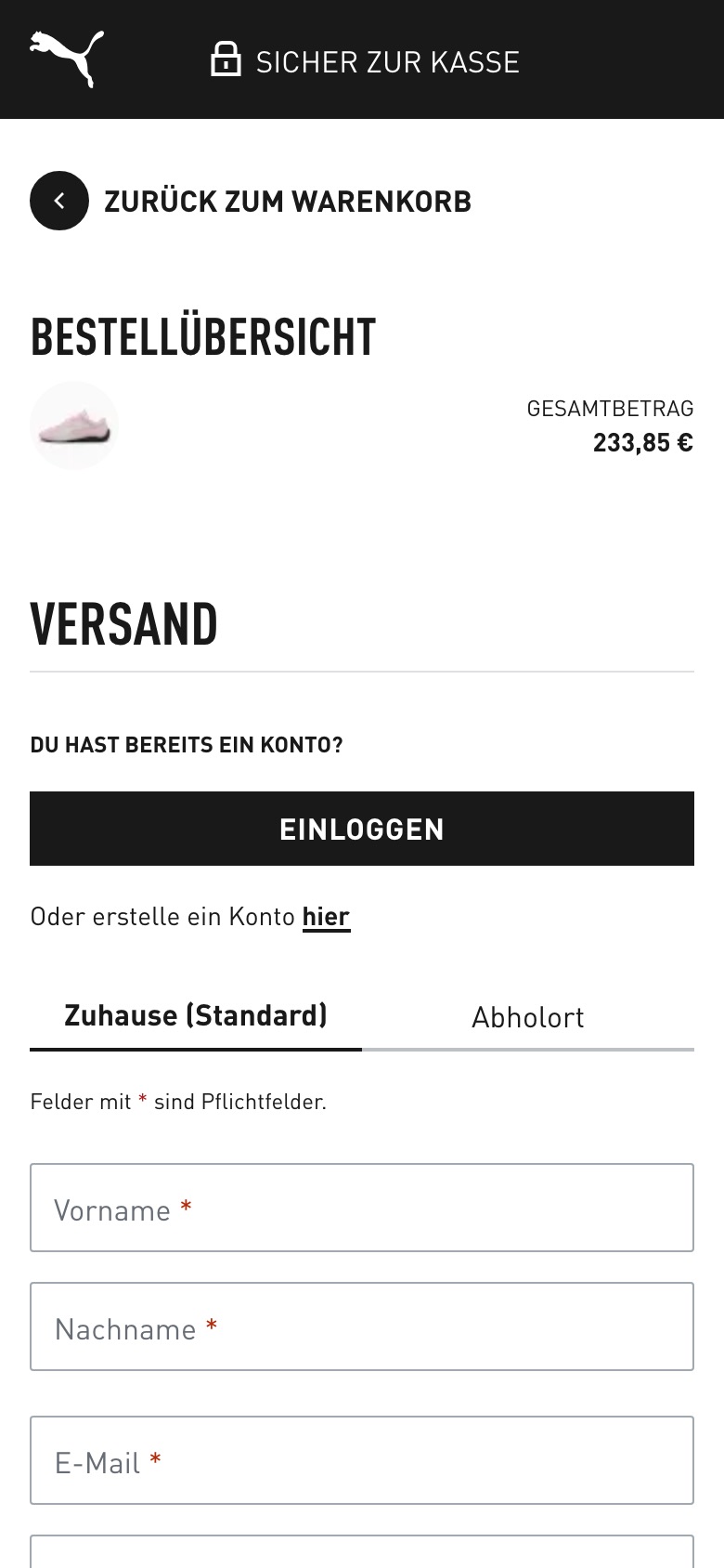
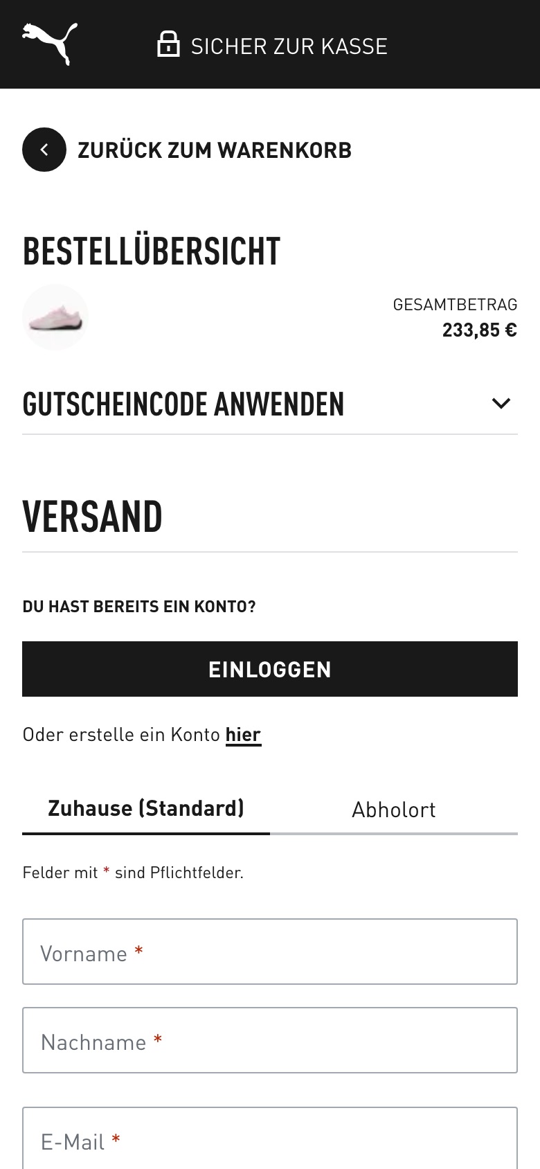
Removes the 'apply voucher code' accordion from the checkout page, leaving the code field in the cart only
Likely hypothesis
By removing the voucher-code field from checkout and keeping it only in the cart, we can lift checkout completion rate, because shoppers already committed to paying are not tempted to leave and hunt for a code at the final step.
Seen 15 Sep to 4 Oct 2026
Problem being solved and strategic takeaway
Problem being solved
A visible code field at checkout invites shoppers to pause and search for discounts just as they are about to pay, which stalls or loses the order.
Strategic takeaway
Put the discount-code entry where shoppers are still deciding (cart), not where they are about to pay (checkout).
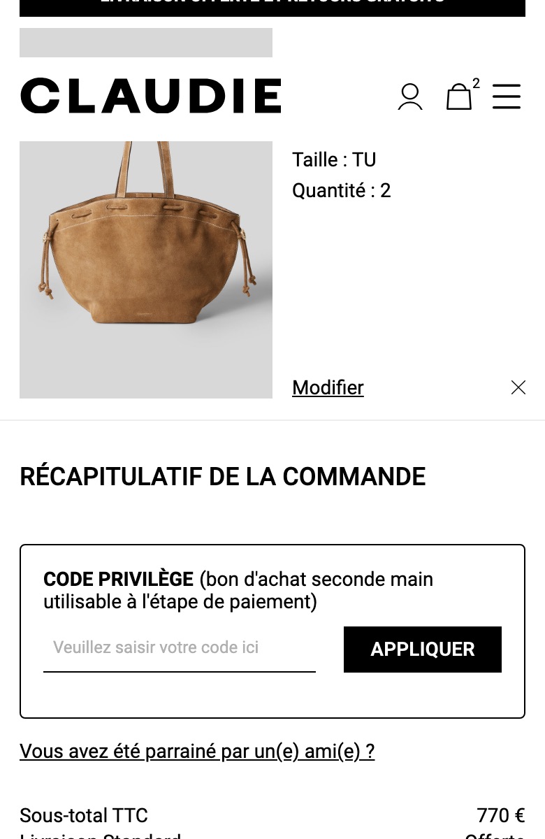
Cart promo code field opened and labelled as a 'Code privilège'
What changed
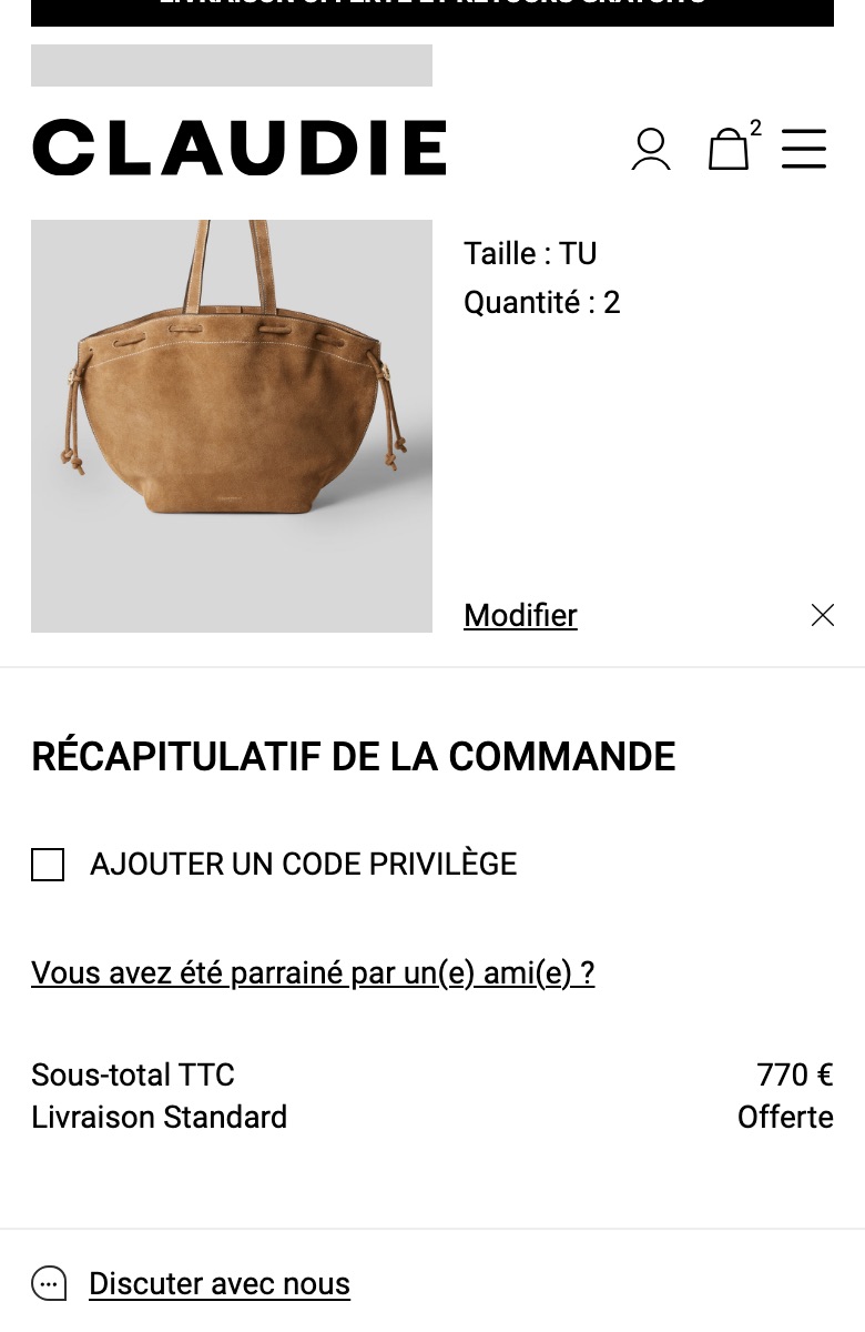
Replaces the 'Ajouter un code privilège' tick-box with an open bordered 'Code privilège' box that has a code field and an 'Appliquer' button
Likely hypothesis
By showing the code field open with a note about where second-hand vouchers apply, we can lift code entry and progress to checkout, because shoppers no longer have to find where their voucher goes.
Seen 25 Sep to 3 Oct 2026
Problem being solved and strategic takeaway
Problem being solved
The code entry is hidden behind a tick-box, so shoppers may not find where to enter a voucher code
Strategic takeaway
Showing a code field open and saying when a credit applies can reduce hesitation and off-site coupon hunting.
Principle
Discount Field Clarity
Reassurance
Guarantees, service promises and payment lines placed where shoppers decide to buy.
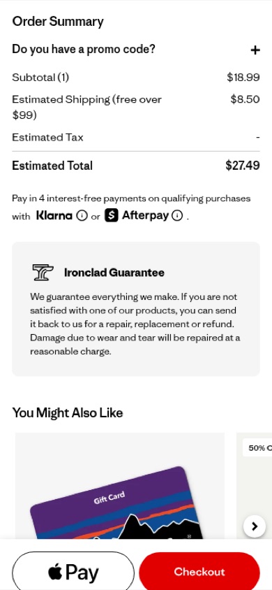
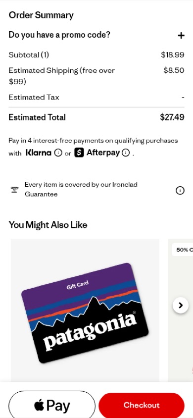
Replaces the one-line Ironclad Guarantee note with a full-copy guarantee panel beneath the cart order totals
Likely hypothesis
By expanding the one-line guarantee note into a full-copy panel beneath the order totals, shoppers see the repair, replacement and refund promise in full at the moment they decide to check out, which may reduce purchase anxiety and lift cart-to-checkout conversion.
Seen 15 Sep to 3 Oct 2026
Problem being solved and strategic takeaway
Problem being solved
A brief guarantee mention is easy to skim past, so shoppers may not register the full returns and repair promise when deciding to check out
Strategic takeaway
Giving a guarantee its own full-copy panel next to the order totals, rather than a one-line mention, makes the promise harder to miss at the point of commitment.
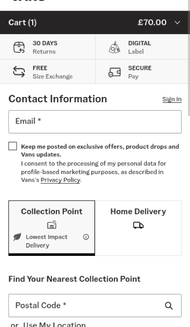
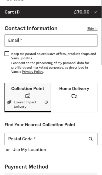
Surfaces a service reassurance strip beneath the checkout header
Likely hypothesis
By surfacing a service-reassurance strip directly beneath the checkout header, we can lift checkout completion rate, because shoppers see returns and service guarantees at the exact moment purchase hesitation peaks.
Seen 18 Aug to 4 Oct 2026
Problem being solved and strategic takeaway
Problem being solved
Last-minute doubt about returns and service commitments before paying
Strategic takeaway
Surfacing return and guarantee messaging at the payment step can reduce purchase anxiety, because reassurance works best where commitment cost feels highest.
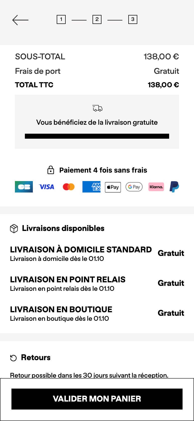
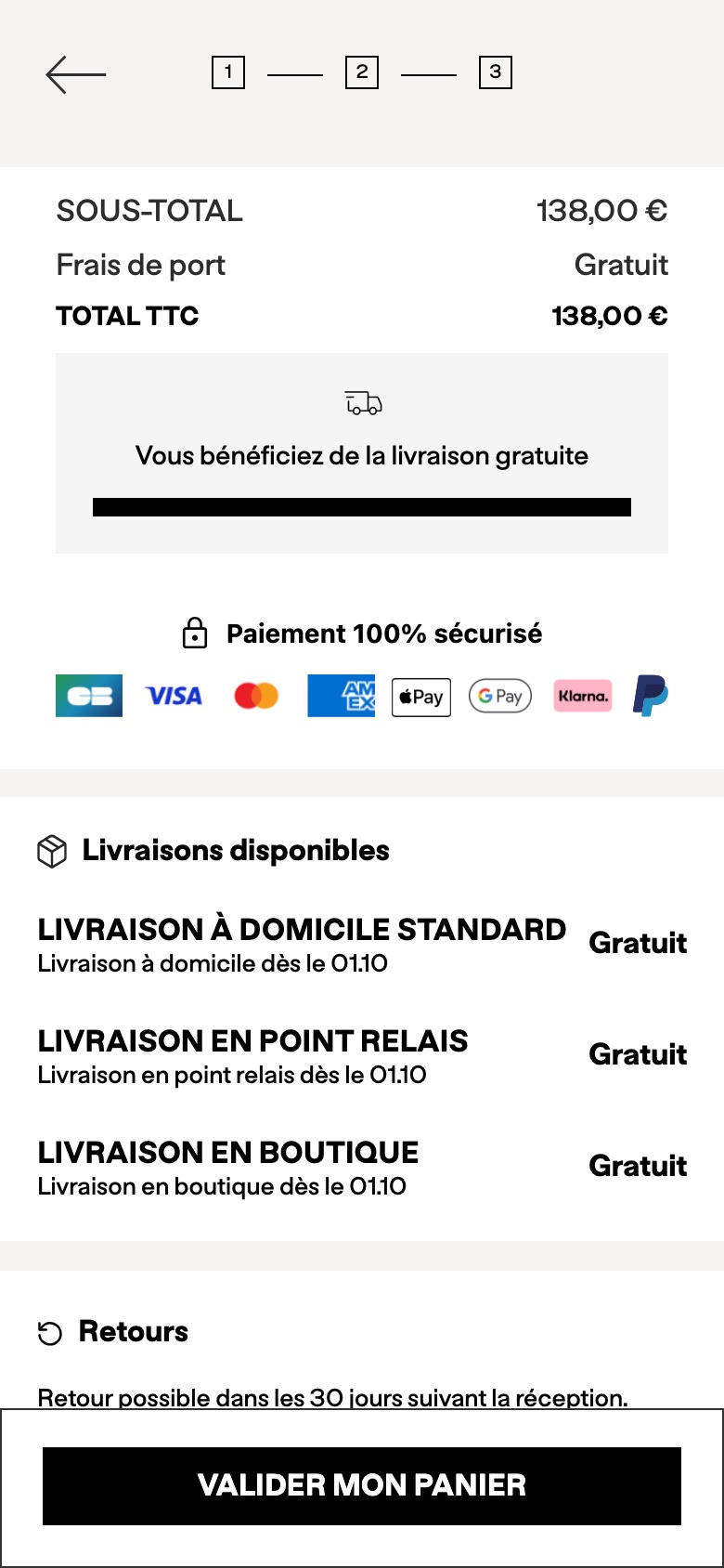
Cart reassurance line: pay in 4 instead of secure payment
Likely hypothesis
By replacing the security reassurance with an interest-free instalments message in the cart, we can lift basket-to-checkout conversion, because price flexibility is a stronger nudge than payment security for a fashion basket at this price point.
Seen 2 Sep to 3 Oct 2026
Problem being solved and strategic takeaway
Problem being solved
Shoppers hesitate over the basket total without knowing they can split the payment
Strategic takeaway
One line above the payment logos can carry either a security or an affordability message; testing which converts better tells you which anxiety dominates at checkout.
Principle
Reassurance Choice
Cart layout
How much each cart item shows, and which button leads.
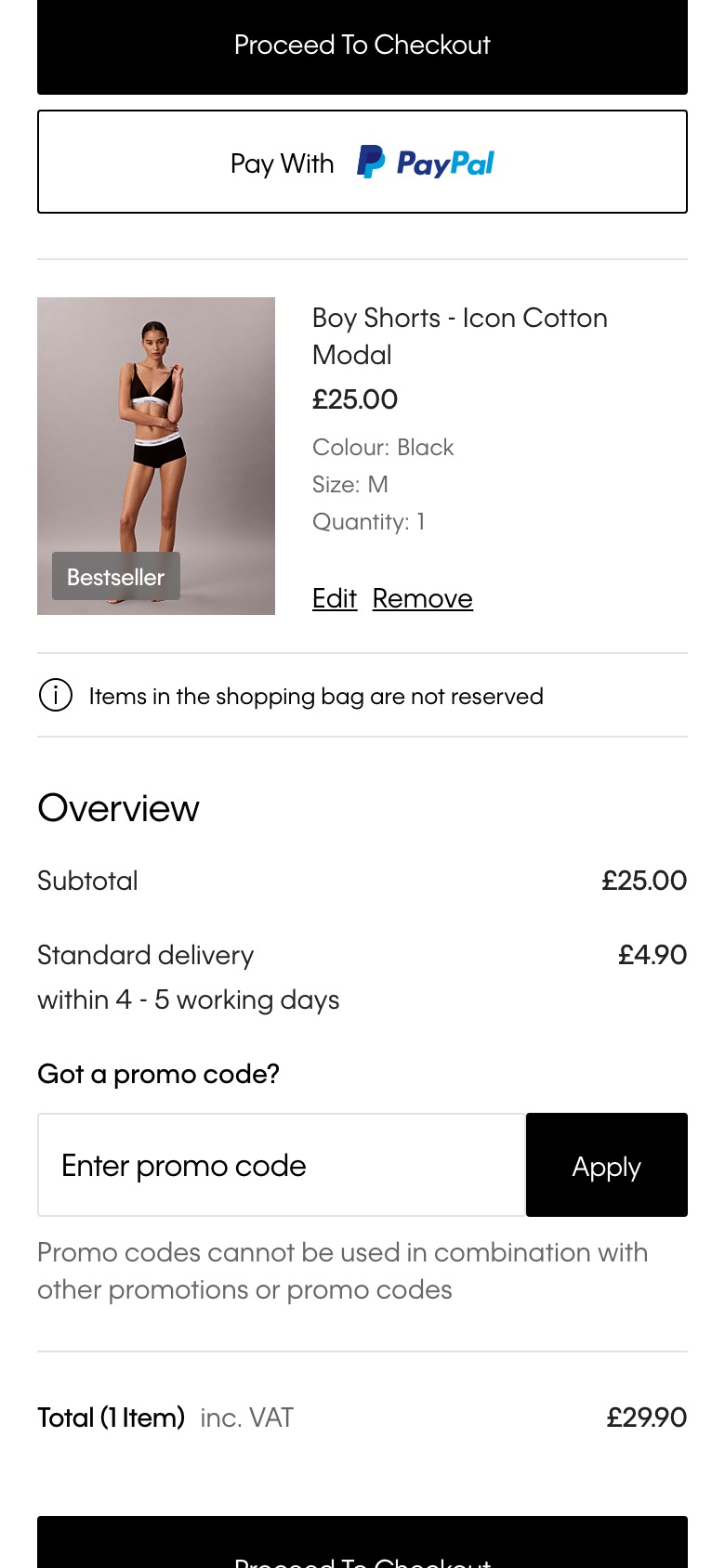
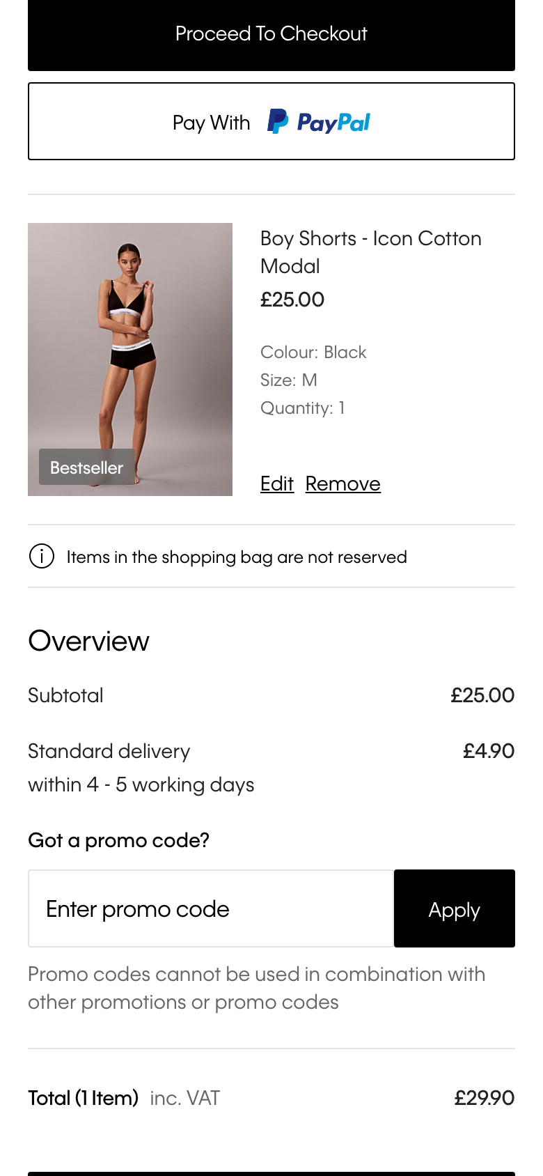
Shrinks basket product images and tightens mobile line-item spacing
Likely hypothesis
By shrinking basket product images and tightening line-item spacing on mobile, we can lift basket-to-checkout progression, because a more compact line item lets shoppers confirm their order with less scrolling.
Seen 17 Sep to 4 Oct 2026
Problem being solved and strategic takeaway
Problem being solved
Bulky basket rows push order details and the checkout action below the fold
Strategic takeaway
Tightening imagery and spacing in list-style review steps can reduce scrolling and cognitive load, helping shoppers verify an order and move forward faster.
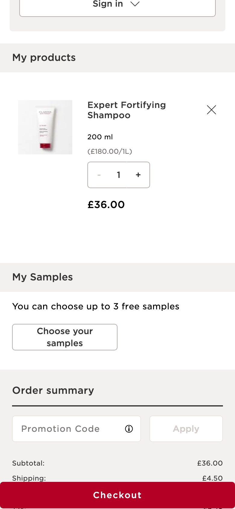
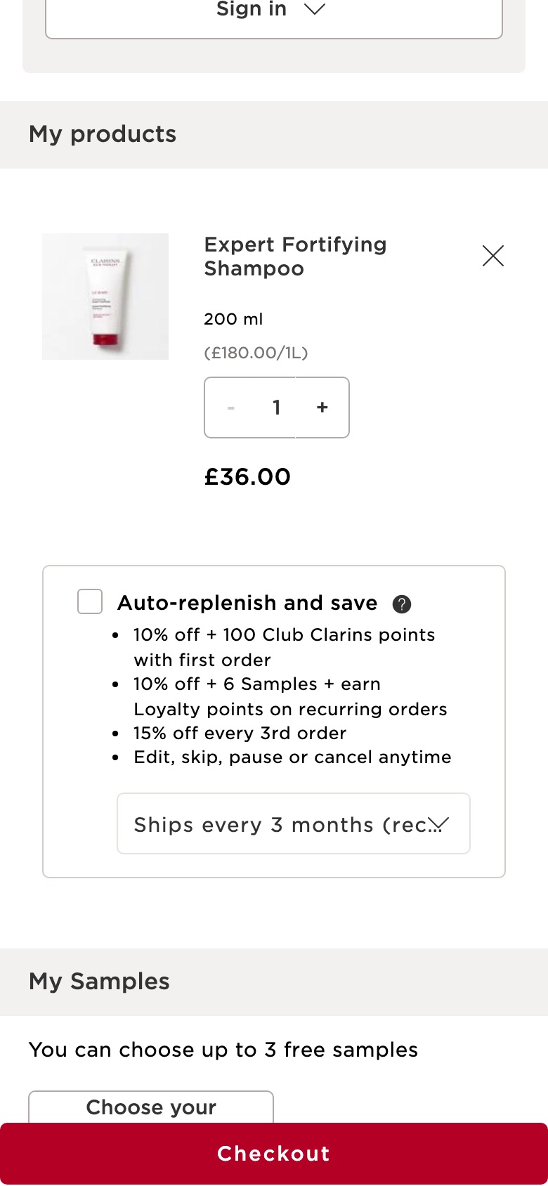
Hides the subscribe-and-save option on each shopping bag item
Likely hypothesis
By removing the per-item subscription option from the shopping bag, we can lift bag-to-checkout progression, because shoppers face one fewer decision at the point where they are trying to confirm and pay rather than reconsider how they buy.
Seen 21 Aug to 3 Oct 2026
Problem being solved and strategic takeaway
Problem being solved
An extra purchase-model decision distracts shoppers who have already chosen to buy
Strategic takeaway
Removing secondary purchase-model choices from the final review step can reduce decision paralysis and keep attention on completing the order.
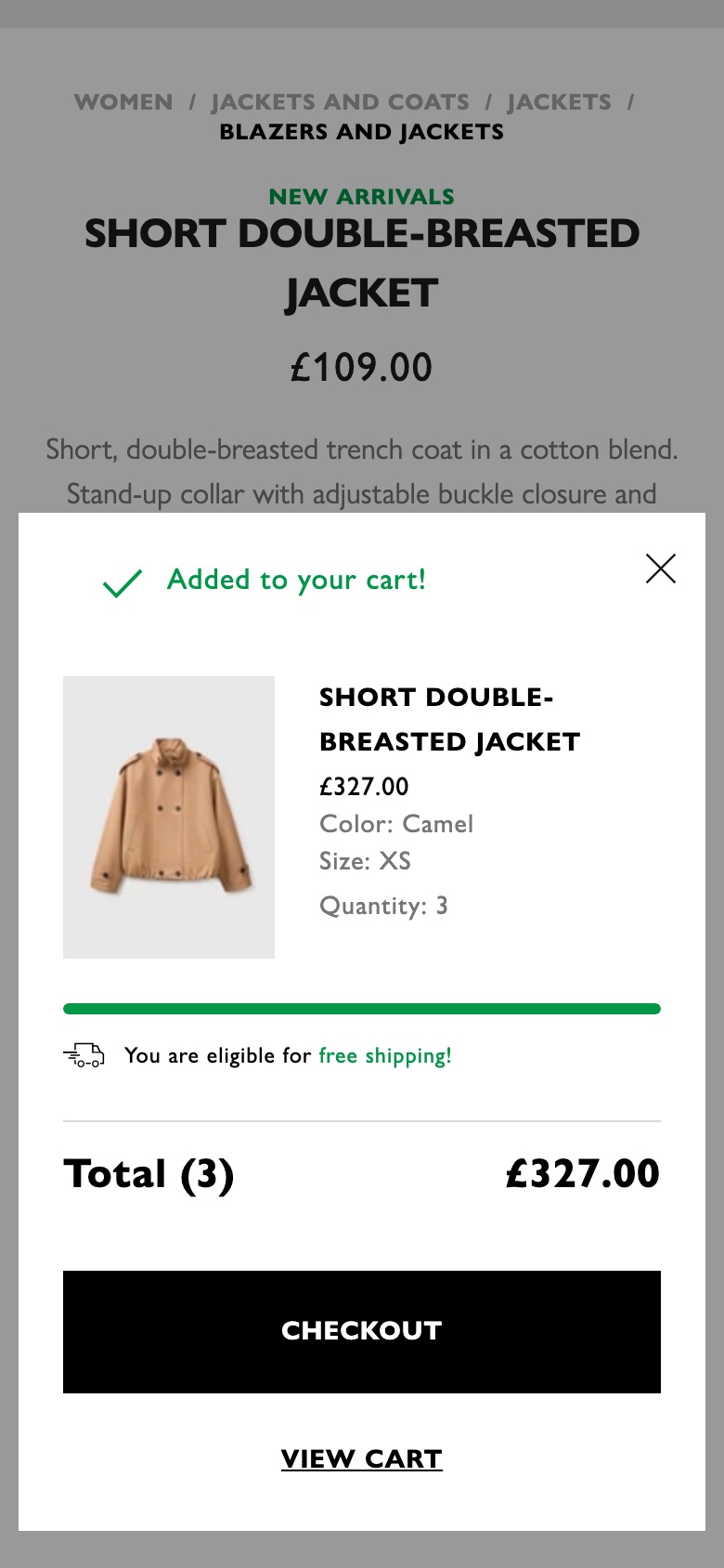
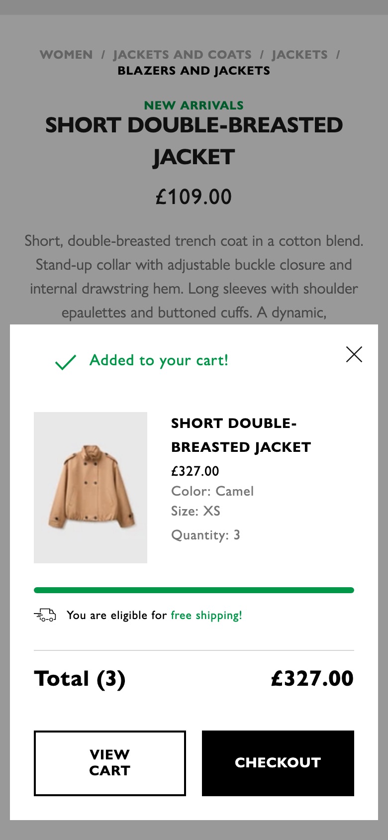
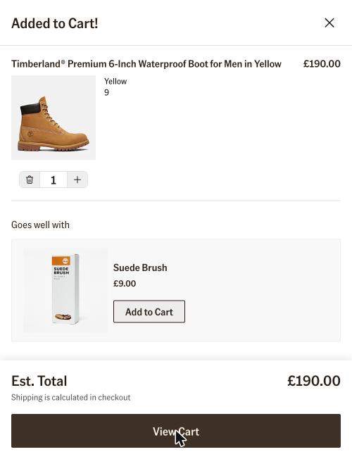
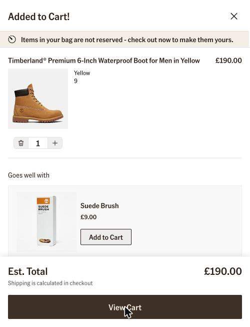
Checkout-first buttons in the added-to-cart pop-up
What changed
Checkout becomes a full-width primary button in the added-to-cart pop-up; View cart becomes a text link below it
Likely hypothesis
By making Checkout the only full-width button in the added-to-cart pop-up and demoting View cart to a text link, we can lift the share of shoppers who go straight to checkout, because one clear next step removes the pause of choosing between two equal buttons.
Seen 19 Sep to 3 Oct 2026
Problem being solved and strategic takeaway
Problem being solved
Two equal-weight buttons after add-to-cart split attention between reviewing the bag and checking out
Strategic takeaway
Giving the checkout path clear visual priority right after add-to-cart can cut hesitation, because shoppers follow the most prominent next step.
Principle
Single Primary Action
Cross-sell in the cart
Product suggestions in the cart, added or taken away.
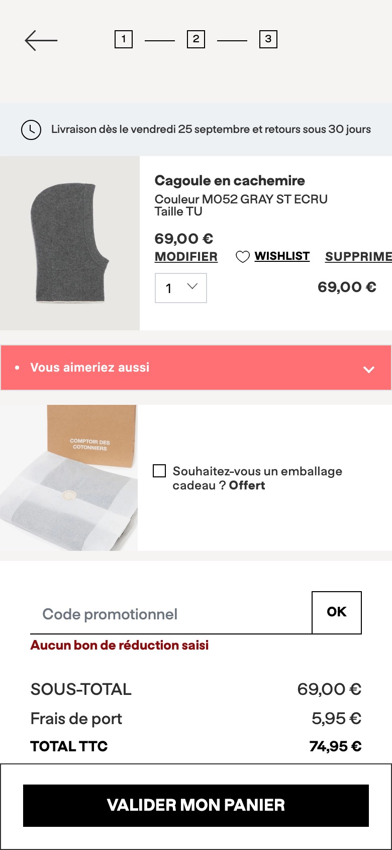
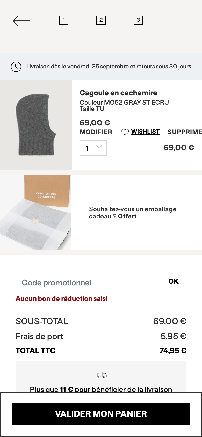
Cart 'Vous aimeriez aussi' bar under the basket item
What changed
Adds a coral 'Vous aimeriez aussi' (you may also like) bar with a down-arrow under the cart item
Likely hypothesis
By adding a bright 'you may also like' bar directly under the cart item, we can lift add-on items per order, because basket review is a natural pause point and a hard-to-miss cue there invites shoppers to consider more pieces before checking out.
Seen 3 Aug to 3 Oct 2026
Problem being solved and strategic takeaway
Problem being solved
The cart gives shoppers no visible cue to consider other pieces before they check out
Strategic takeaway
A visually distinct cue placed where shoppers stop to review their basket can draw attention to secondary merchandising they would otherwise not look for.
Hides the suggested-products block from the cart summary
Likely hypothesis
By hiding the product recommendations from the cart summary, we can lift cart-to-checkout conversion, because shoppers are not pulled back into browsing at the moment they are ready to pay.
Seen 1 Sep to 9 Sep 2026
Problem being solved and strategic takeaway
Problem being solved
Removes a browsing detour that competes with completing the purchase
Strategic takeaway
Stripping cross-sell content from late-funnel steps can reduce competing choices and keep attention on completing the transaction.
Principle
Distraction Removal
Free-delivery message
How the cart tells shoppers what is left to spend for free delivery.
Rewords the cart free-delivery progress message to 'Just £X more to unlock FREE delivery!'
Likely hypothesis
By rewording the cart free-delivery progress message to frame the remaining amount as something to unlock, we can lift the share of shoppers who add more to reach the threshold, because an unlock framing makes the free delivery feel like a reward within reach rather than a shortfall.
Seen 18 Sep to 4 Oct 2026
Problem being solved and strategic takeaway
Problem being solved
Shoppers below the free-delivery threshold are not motivated to add the extra amount needed
Strategic takeaway
Wording the gap to a free-delivery threshold as an unlockable reward can nudge shoppers to top up their basket more than a neutral distance statement.
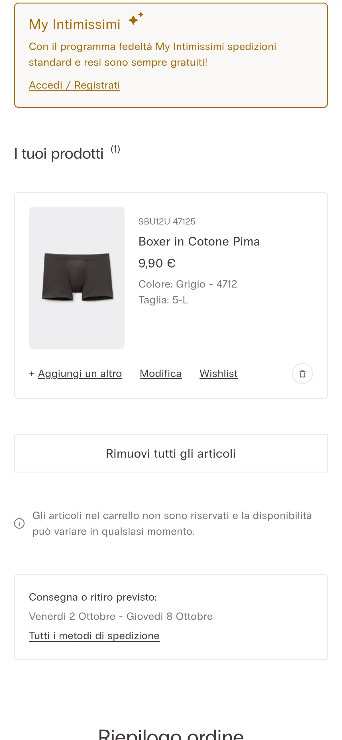
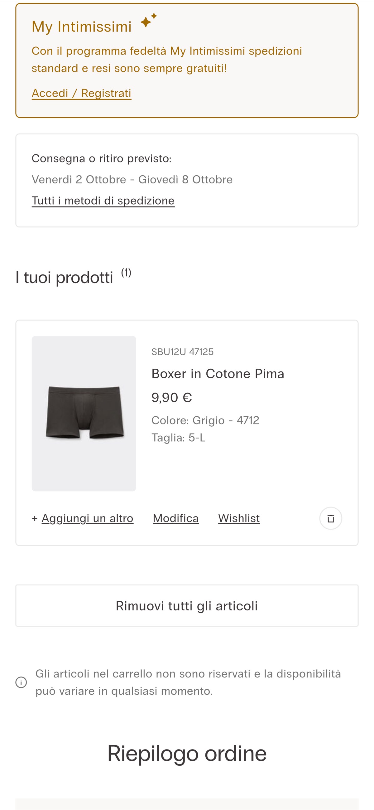
Moves estimated delivery message below the stock availability notice
Likely hypothesis
By repositioning the estimated delivery message below the stock availability notice on the cart page, we can lift cart-to-checkout progression, because shoppers read availability and delivery timing in a more natural sequence before committing to checkout.
Seen 25 Sep to 3 Oct 2026
Problem being solved and strategic takeaway
Problem being solved
Delivery timing competes with availability messaging, muddling the shopper's pre-checkout reassurance order
Strategic takeaway
Ordering reassurance messages to match the shopper's natural questions — can I get it, then when will it arrive — may reduce cognitive load before checkout.
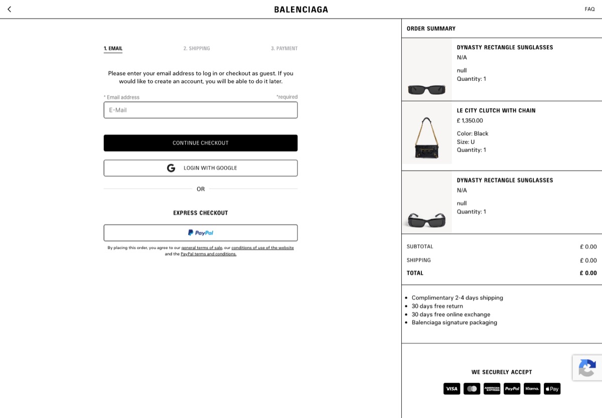
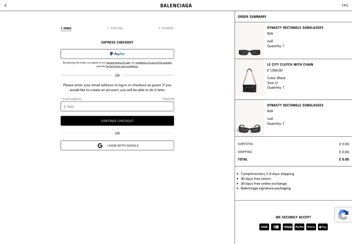
Moves the Express Checkout PayPal button from the top of the email step to below the email field
Likely hypothesis
By moving express payment below the email field at the start of checkout, we can lift email capture and standard checkout progression, because shoppers meet the email entry first instead of being pulled into a third-party wallet before identifying themselves.
Seen 21 Sep to 3 Oct 2026
Problem being solved and strategic takeaway
Problem being solved
Leading with express payment skips email capture and pushes shoppers out to a third-party wallet first
Strategic takeaway
Where the express-payment option sits relative to email entry decides which path most shoppers take, trading wallet speed against first-party email capture.
Principle
Checkout Path Ordering
Sign-in prompts
Asking returning customers to log in on the way to checkout.
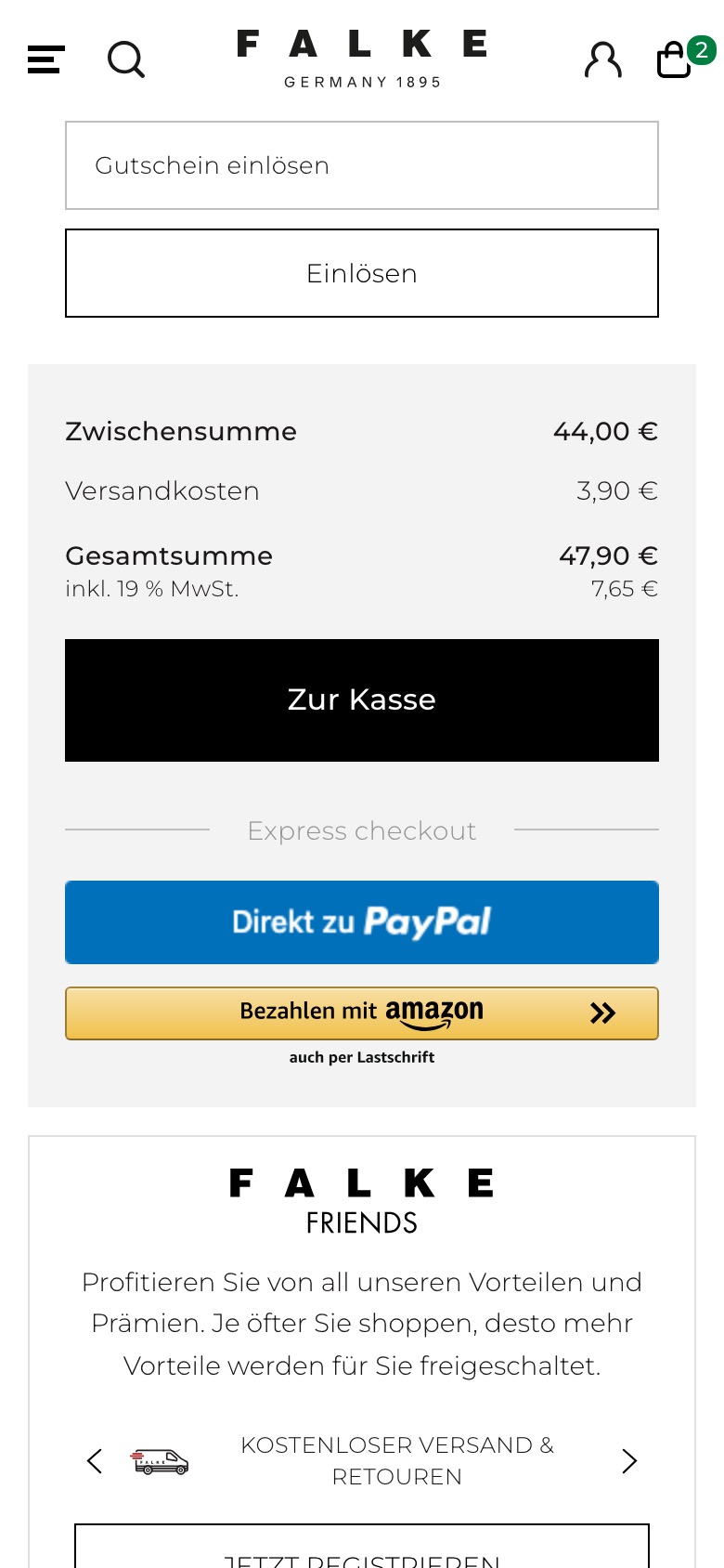
Adds a tappable "Already a customer? Log in" prompt directly beneath the basket's checkout button
Likely hypothesis
By surfacing a tappable returning-customer sign-in prompt on the cart page, we can lift cart-to-checkout completion, because known shoppers reach their saved address and payment details instead of retyping them as a guest.
Seen 25 Sep to 4 Oct 2026
Problem being solved and strategic takeaway
Problem being solved
Returning shoppers re-entering details they already have saved in their account
Strategic takeaway
Prompting returning users to sign in at the point of purchase can reduce the effort of re-entering known details and lower checkout abandonment.
Checkout gift-wrap options moved to a bottom sheet
What changed
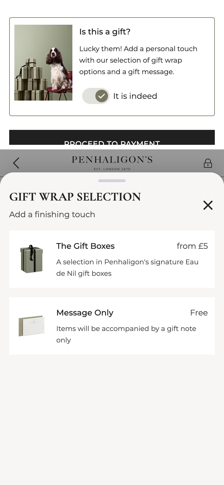
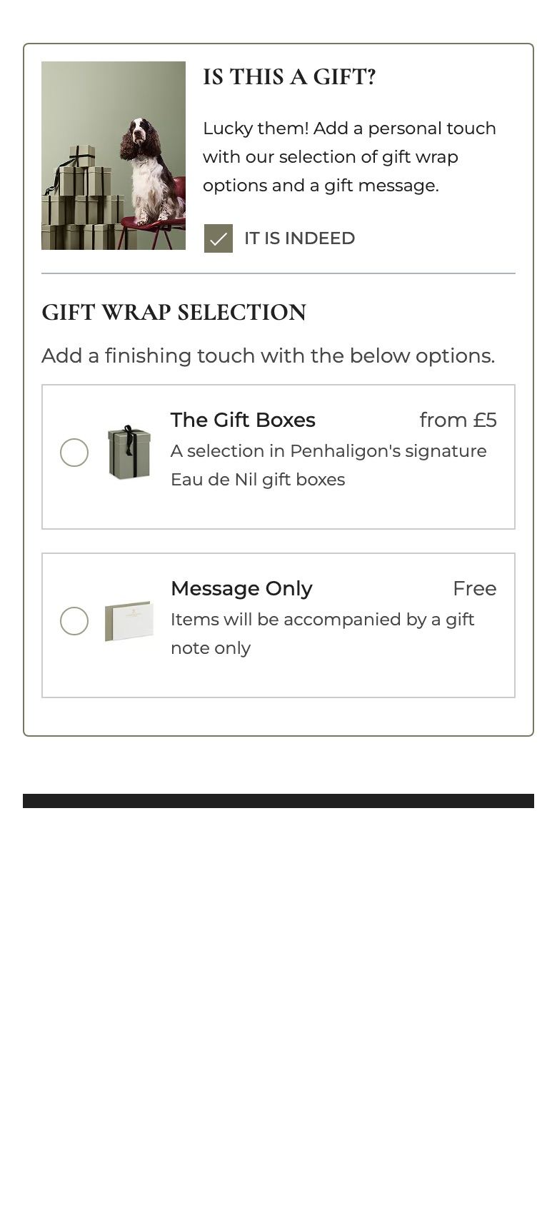
Replaces the inline gift-wrap card with a toggle and moves the wrap options into a bottom sheet
Likely hypothesis
By collapsing gift wrap into a toggle with options in a bottom sheet, we can lift gift-wrap attach rate and keep checkout shorter, because the page stays compact while the options remain one tap away.
Seen 25 Sep to 3 Oct 2026
Problem being solved and strategic takeaway
Problem being solved
An always-open gift-wrap block lengthens checkout and can read as an upsell
Strategic takeaway
Hiding optional add-on choices behind a simple toggle keeps checkout short while keeping the add-on easy to reach.
Principle
Progressive Disclosure
Decided earlier this year
Two cart experiments from earlier in the record with a final outcome. Outcomes are per experiment and say what that brand did, not what will work elsewhere.
If we put our returns and guarantee promise beside the checkout button,then more shoppers will start checkout,because the doubt is answered at the moment it appears.
If we word the free-delivery gap as something to unlock,then more shoppers will add an item to reach it,because a reward in reach motivates more than a shortfall.
A real split was live on 3–4 October. It can end any day.
Outcomes
Recorded when the brand removes or keeps the change.
Refreshed
This page is refreshed before Black Friday week.
What this page does not tell you
Whether a change works: there are no outcome rates here. When a brand started: first seen is when ABSee first recorded a test. What will work for you: one experiment is one brand’s decision, with its own shoppers.
Questions
Which of these changes work best for the holiday peak?
ABSee publishes no rate for any theme here. The record shows, per experiment, whether the brand kept the change; that is part of the Intelligence plan.
What does going into peak mean here?
The report covers cart and checkout experiments ABSee first recorded from August onwards, as retailers prepare for the holiday season. It says what is in test, not how testing compares with an earlier season.
Is testing in checkout higher than last year?
ABSee cannot say. The record starts in May 2026, and many brands entered it in September, so counts from different months are not comparable.
When is this report updated?
It is refreshed before Black Friday week, once the experiments retailers run in October and November are in the record.
Ask your assistantWhat are retailers testing in cart and checkout ahead of Black Friday?
Works in Claude, ChatGPT or Gemini once ABSee is connected.
 BalenciagaCheckout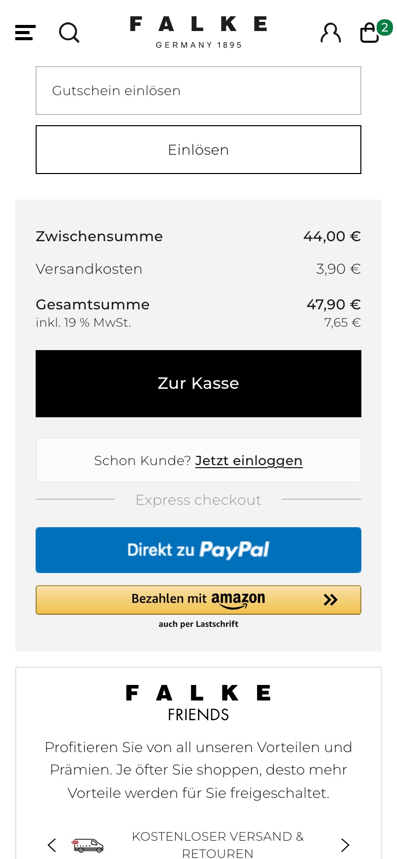
 TimberlandMini-cart
 QuayCart