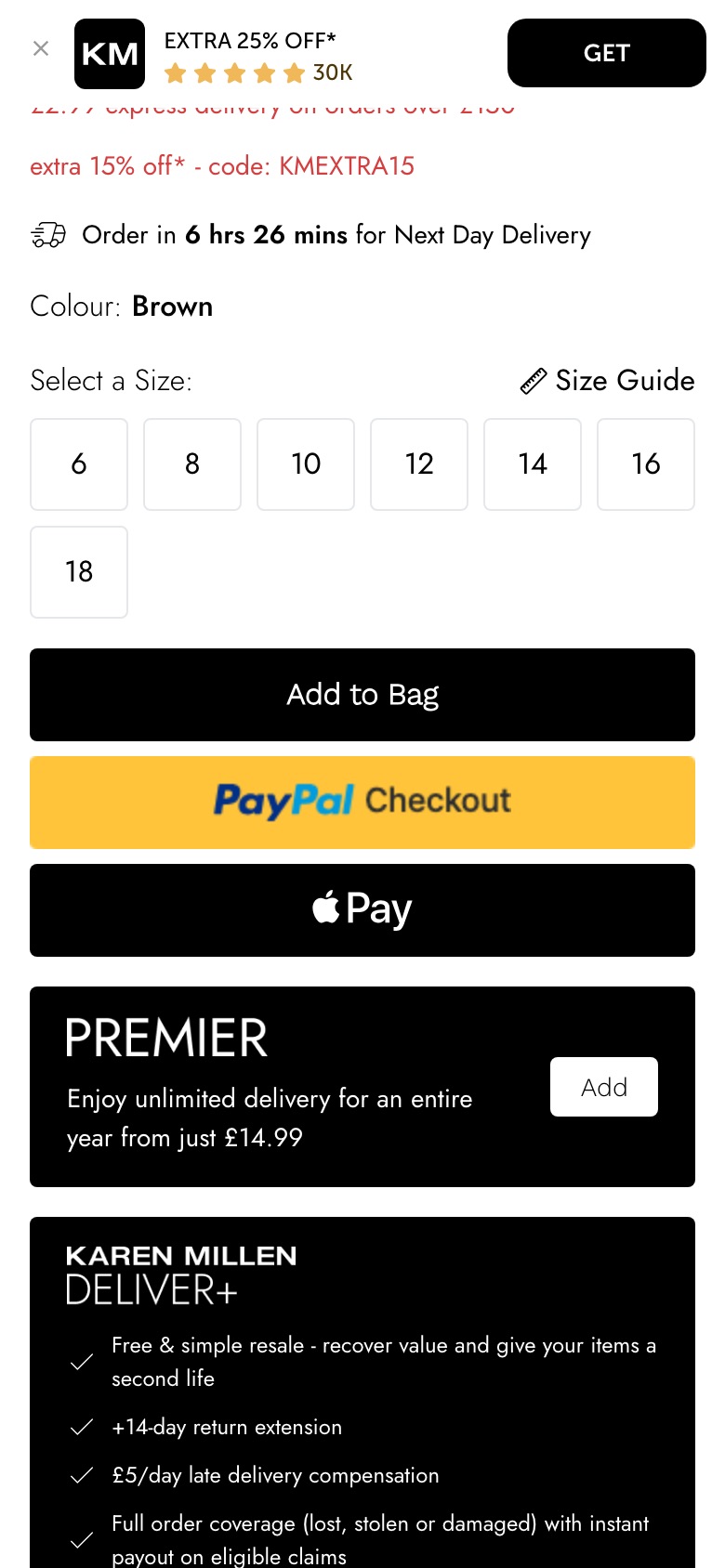
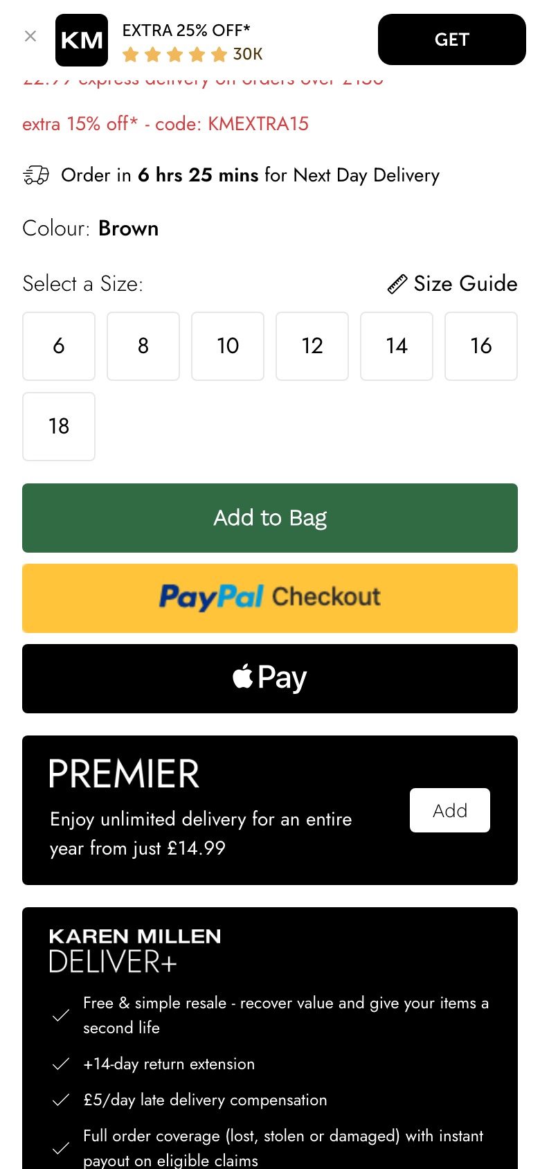
Karen MillenProduct page
Add-to-bag button colour test
What changed Turns the Add to Bag button from black to deep green
Seen 27 Aug to 27 Aug 2026
Rolled back
ABSee / Guides / Product page optimisation
GuideThis guide covers what ecommerce brands test on the product page, the page where a shopper decides whether to buy. ABSee has recorded 200+ brands testing here over May to October 2026.
Updated October 2026 · Source: ABSee record · Methodology →
Each tile is one kind of change brands tested on the product page. The chip is a size word: how many brands in the record tested it.
Similar items, complete the look, recently viewed, and rows moved above the reviews.
Colour, wording, a button that works before a size is chosen, taller buttons and sticky bars.
Video first, grid layouts, zoom, on-model lead photos, AI-generated model shots removed.
Bullets, accordions collapsed or open, reasons-to-buy lists, sections removed.
How a discount is shown, red sale prices, member price first, free-gift badges, bundle builders.
Size guides, fit notes, finders and the size picker itself.
Low-stock lines, recent-purchase counters and other signs that people are buying.
Where reviews sit, review summaries, and star ratings near the price.
Free-returns callouts, delivery rows and reassurance stacks under the buy button.
Where a theme has its own pattern page, this guide gives two sentences and sends you there; the depth goes to the themes that do not. All of them sit under the product page hub.
Brands tested what the shopper sees first: a video leading the gallery, a grid in place of a carousel, zoom, an on-model lead photo, and AI-generated model shots taken out again.
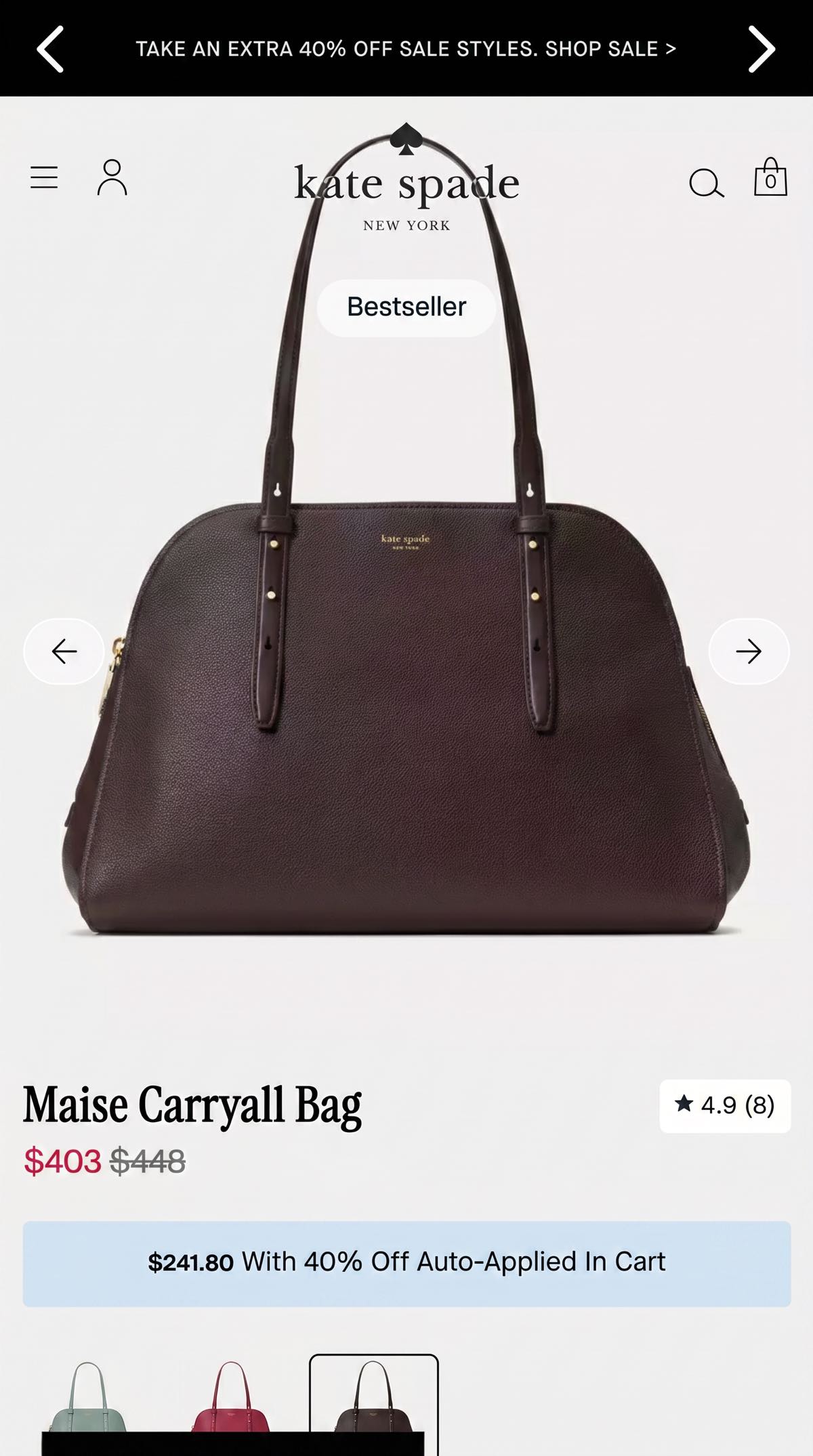
A discount label or the sale price alone, red prices, member price first, free-gift badges. Kate Spade tested hiding the discount label and showing only the sale price.
 Kate SpadeProduct page
What changed Hides the discount percentage label from the price display.
Seen 19 May to 17 Jul 2026
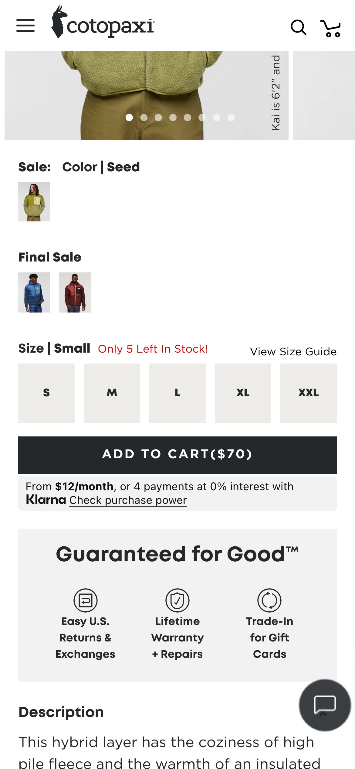
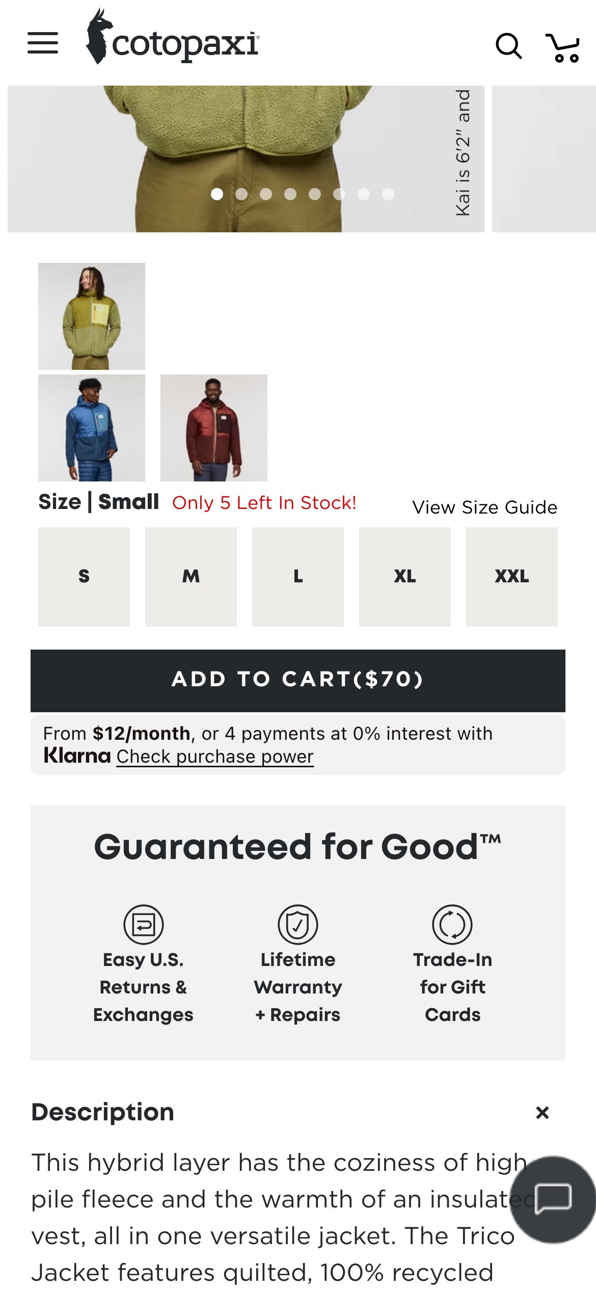
Details collapsed or open by default, bullets in place of paragraphs, sections removed to shorten the page, and swatches that show the product itself. Cotopaxi tested product-photo swatches in place of plain colour dots.
 CotopaxiProduct page
What changed Replaces colour swatches with product photos and a label.
Seen 4 Jul to 31 Jul 2026
Many brands tested the buy box, from button colour to sticky bars; see sticky add-to-cart. Size guides, fit notes and finders have their own page: size and fit.
Signs that other people are buying, low-stock lines and review placement each have a pattern page. See social proof, low-stock and urgency and reviews placement.
Every theme above is made of records like this one, with every field shown: before and tested, what changed, the likely hypothesis, the takeaway, the dates and what the brand did next.
Seen 19 Jun to 17 Jul 2026
On the Intelligence plan your assistant files comparable experiments as evidence for, against, or closest match. An illustration of the format, built from public experiments. Your assistant returns the comparable experiments ABSee finds for your own hypothesis.
If we remove secondary content from the product page,then more shoppers will add to bag,because there is less to distract them.
Start from where your own shoppers leave or hesitate.
Find brands like yours, what they tested and what they did next.
Only your own experiment tells you what works on your site.
No outcome rates. Whether each brand kept a change is part of the Intelligence plan.
First seen is when ABSee first recorded a test, not when the brand began it.
One experiment is one brand's decision, with its own shoppers.
ABSee publishes no rate for any theme here. The record shows, per experiment, whether the brand kept the change; that is part of the Intelligence plan.
In the ABSee record, many brands tested recommendations, the buy box and add-to-cart button, the gallery, and the product details. Those are size words, never a share or a ranking.
The hub lists every product page pattern with its own page. This guide covers the whole page and gives the most room to themes that have no pattern page yet.
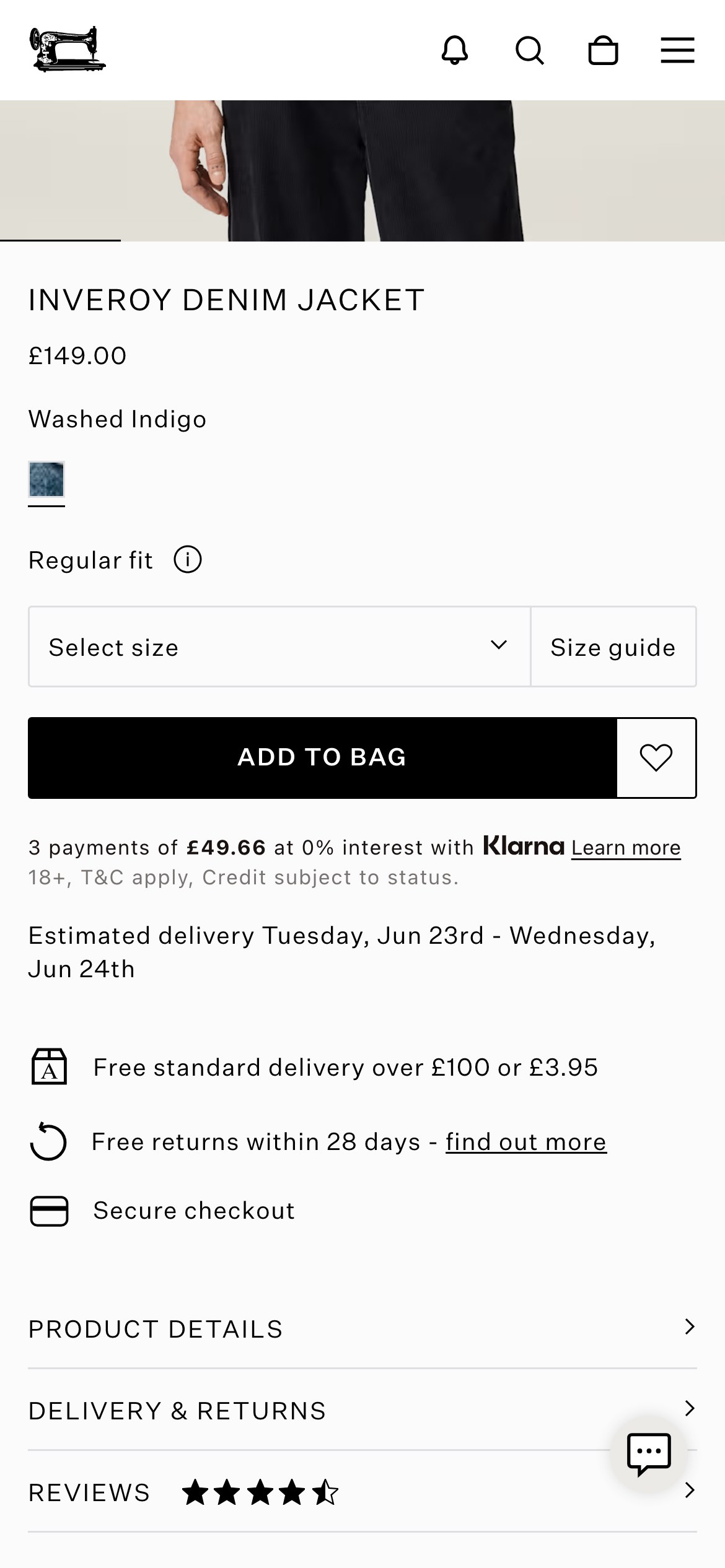
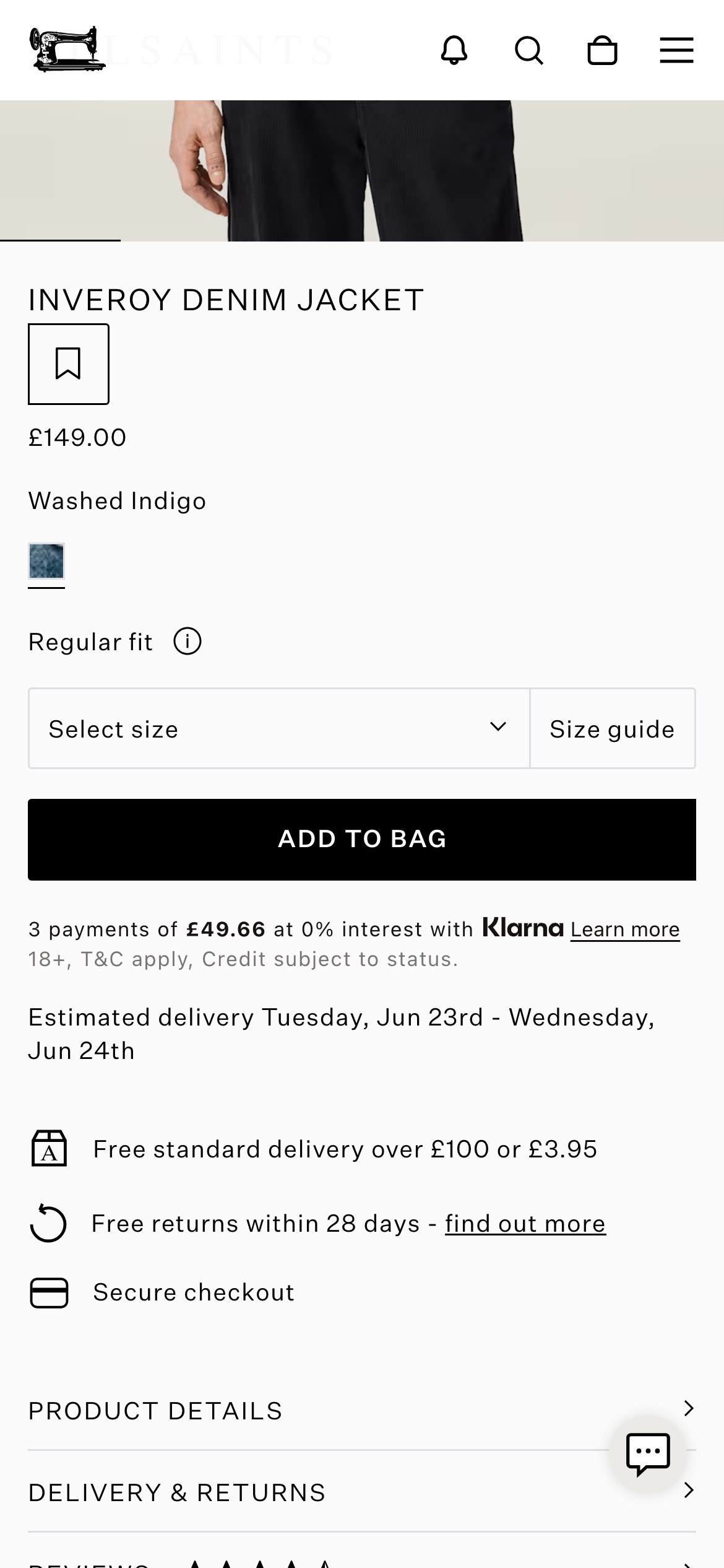
Karen Millen, Kate Spade, Cotopaxi, AllSaints, Reebok and Zimmermann, as public examples. The other brands are named in the record.
What are the most common product-page experiments in my category?
Works in Claude, ChatGPT or Gemini once ABSee is connected.
Connect your AI →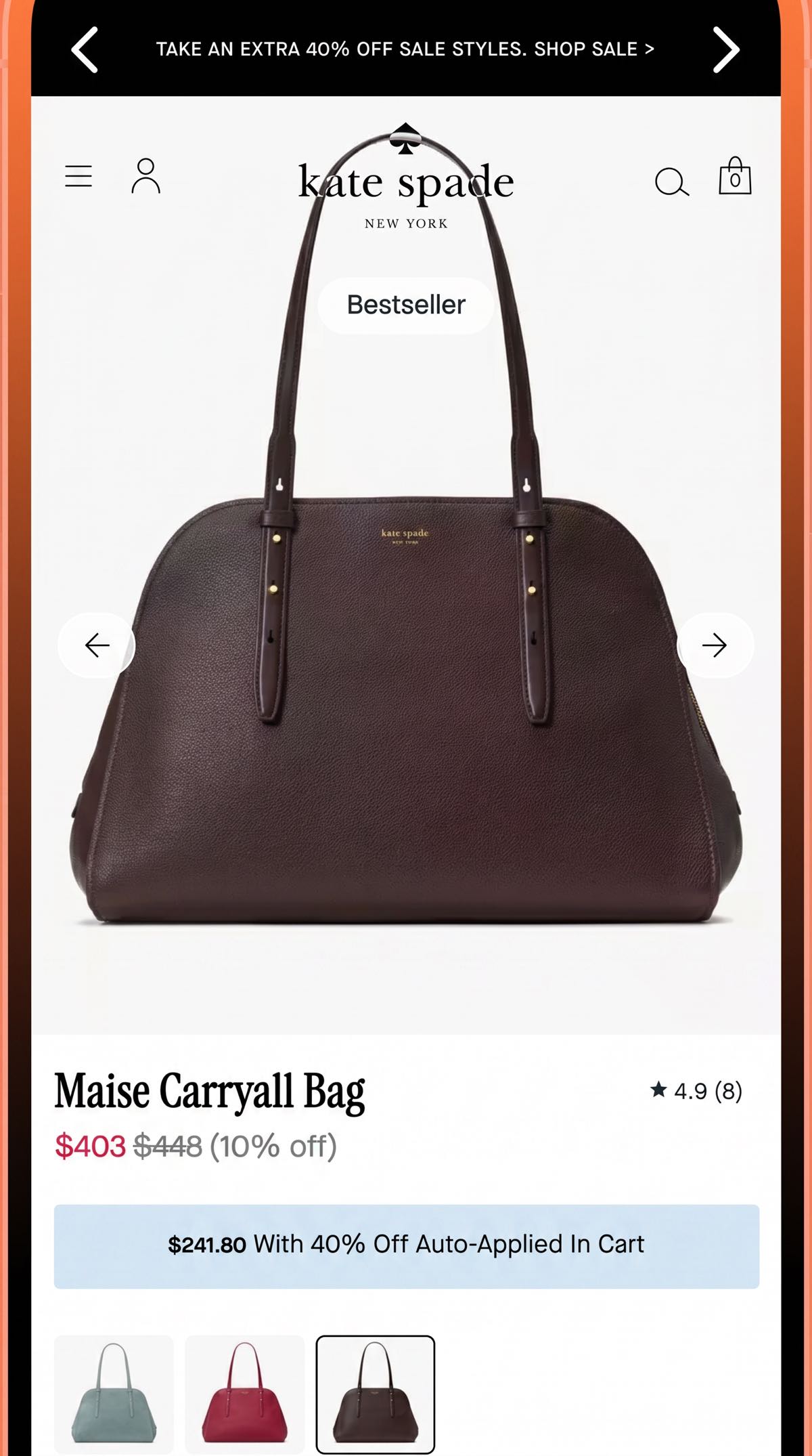
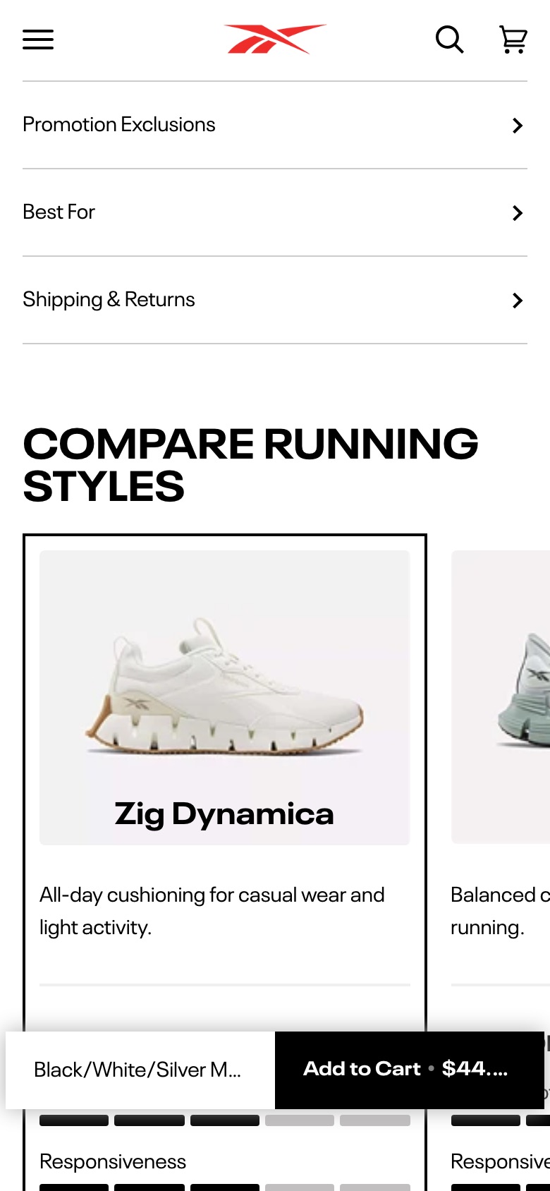
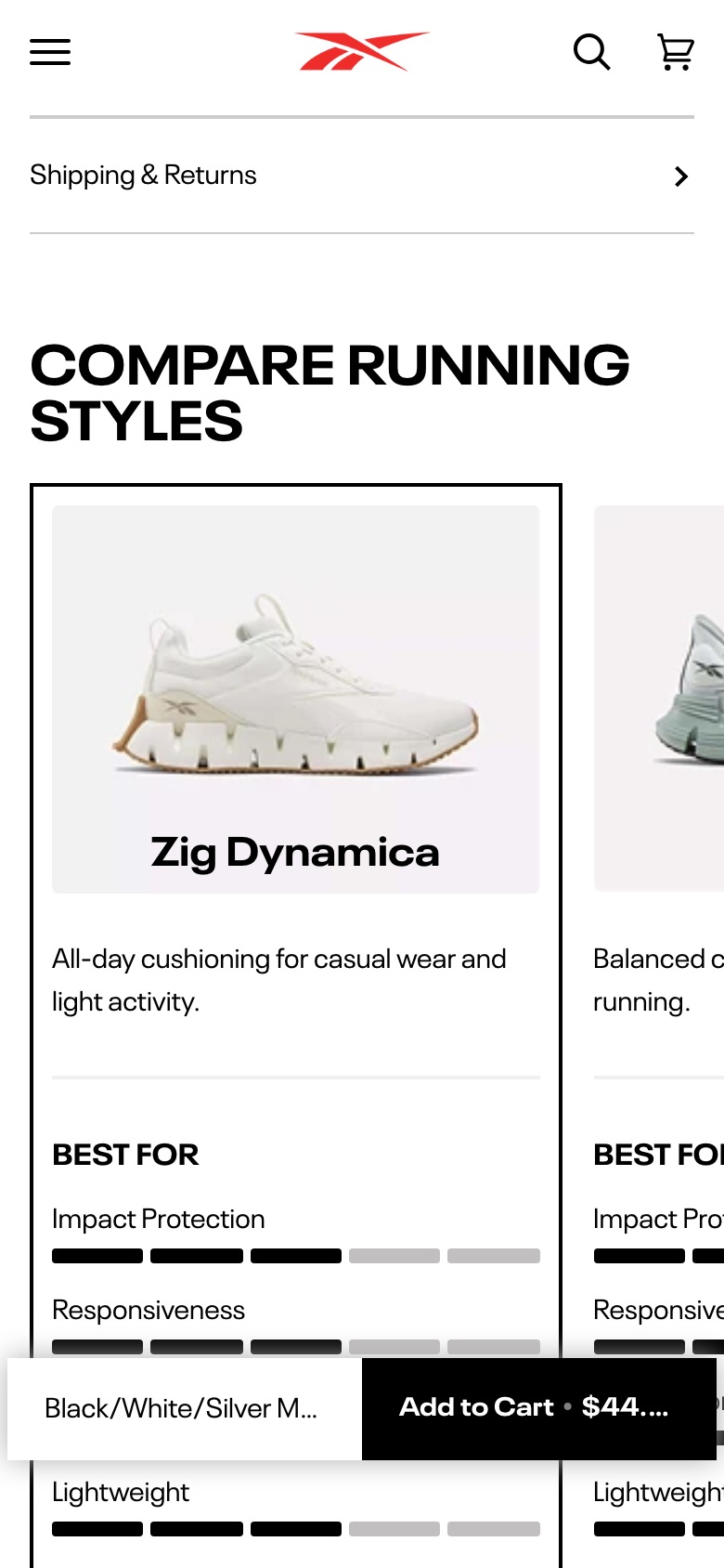
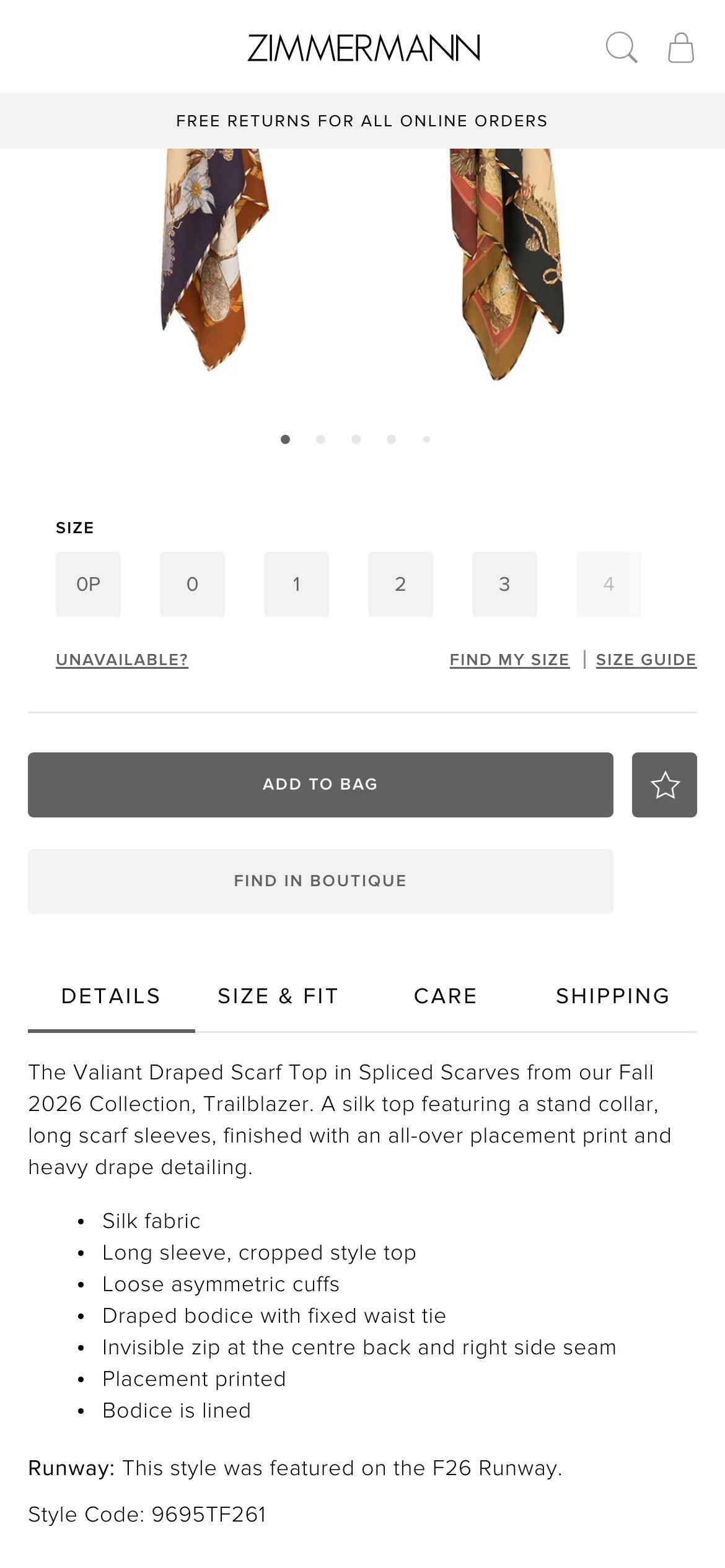
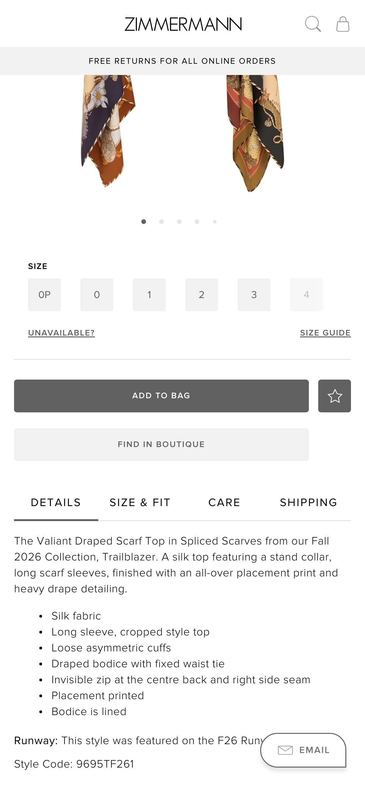
 ZimmermannProduct page